
Doug Knapton
A Flexible Design System that brings the brand to life.
Role
Senior Designer
Scope
User Research
Information Architecture
Usability Testing
Website Design
Brand Refresh
Agency
Constructive
Context
The resource product had grown difficult to navigate for the families who needed it most to find help quickly.
The Child Mind Institute is a nonprofit connecting families to children's mental health resources. With over 2,000 guides and resources, the resource product had grown difficult to navigate for the families who needed it most to find help quickly.
As Lead UX/UI Designer, I owned the end-to-end process from user journey mapping to component-level execution, and led a full overhaul of the brand's visual identity. The goal was to redesign the platform to be more intuitive and inclusive, so more families could easily take the crucial next step of requesting an appointment. A key focus was expanding reach to underserved communities like rural, low-income, and Latinx families who often face the greatest barriers to accessing mental health support.
Post Launch Results
486% Increase in Appointment Requests Page Views
New and returning users are 486% more likely to visit the Request for an Appointment form, directly translating to an increased number of conversions for clinical care.
+14.9% Expanded Reach to Spanish-Speaking Audiences
The site experienced a +14.9% increase in visits from Spanish-speaking users, demonstrating enhanced inclusivity and broader reach.
31% Faster Web Performance
Page load times improved by 31%, contributing to better user satisfaction and SEO.
Post Launch Results
486% Increase in Appointment Requests Page Views
New and returning users are 486% more likely to visit the Request for an Appointment form, directly translating to an increased number of conversions for clinical care.
+14.9% Expanded Reach to Spanish-Speaking Audiences
The site experienced a +14.9% increase in visits from Spanish-speaking users, demonstrating enhanced inclusivity and broader reach.
31% Faster Web Performance
Page load times improved by 31%, contributing to better user satisfaction and SEO.
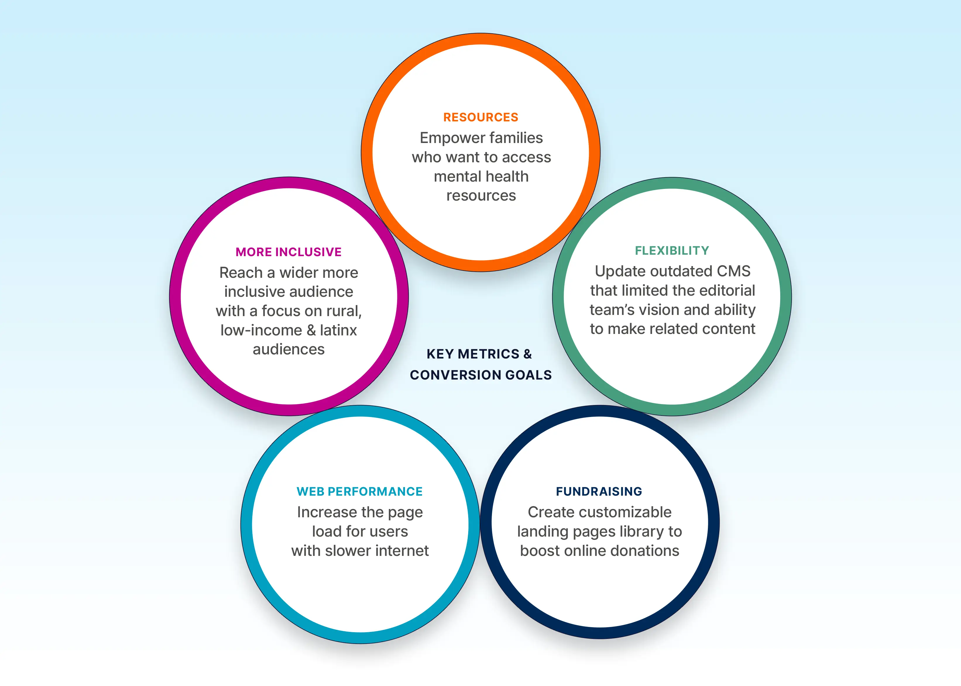
Strategy Roots future design decisions back to real user and business outcomes. I synthesized stakeholder input into a strategic roadmap for success metrics across departments spanning Editorial, Engineering, Marketing, and Development.
The Challenge
The design process began with understanding the user's emotional state.
I developed several user journey maps backed by analytics that traced different personas’ paths from real-world parenting concerns to booking an appointment at Child Mind Institute.
It was during the stakeholder workshops that a stark, qualified pain point arose: "95% of people aren't going to make an appointment."
Rather than treating this as an acceptable outcome, I used it as a design brief, asking directly, "How can the design increase the rate?" which led us to brainstorming UX solutions on how to bridge a critical mid-journey user pain point between reading an article and actually booking an appointment.
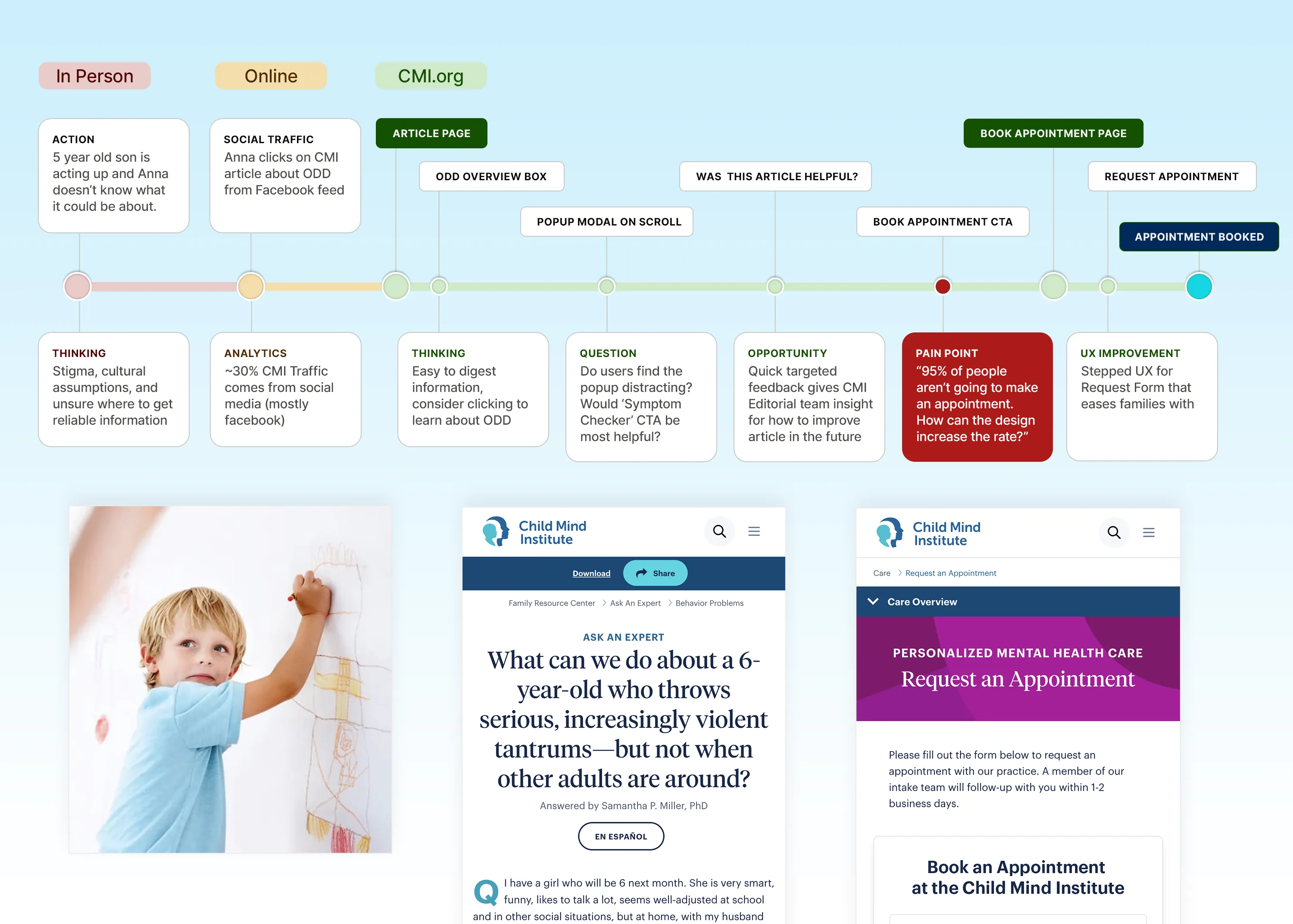
User Journey Maps grounding the entire UX practice in empathy rather than assumption. This flow charts a parent coming to the site from social media to reaching out to book an appointment.
The Process
Rapid testing new features that would help empower families on their care journey
After doing initial user research on the current site's analytics and mapping user journeys, it was time to start creating wireframe prototypes to test some new features that would help empower families to receive the care they needed. Since this website redesign was grounded in service design, it was crucial to do user usability testing to ensure the new features and user flow were intuitive before investing too many resources. Another consideration to keep the project on track was aligning on how to simplify the reusable component library during the wireframe stage.
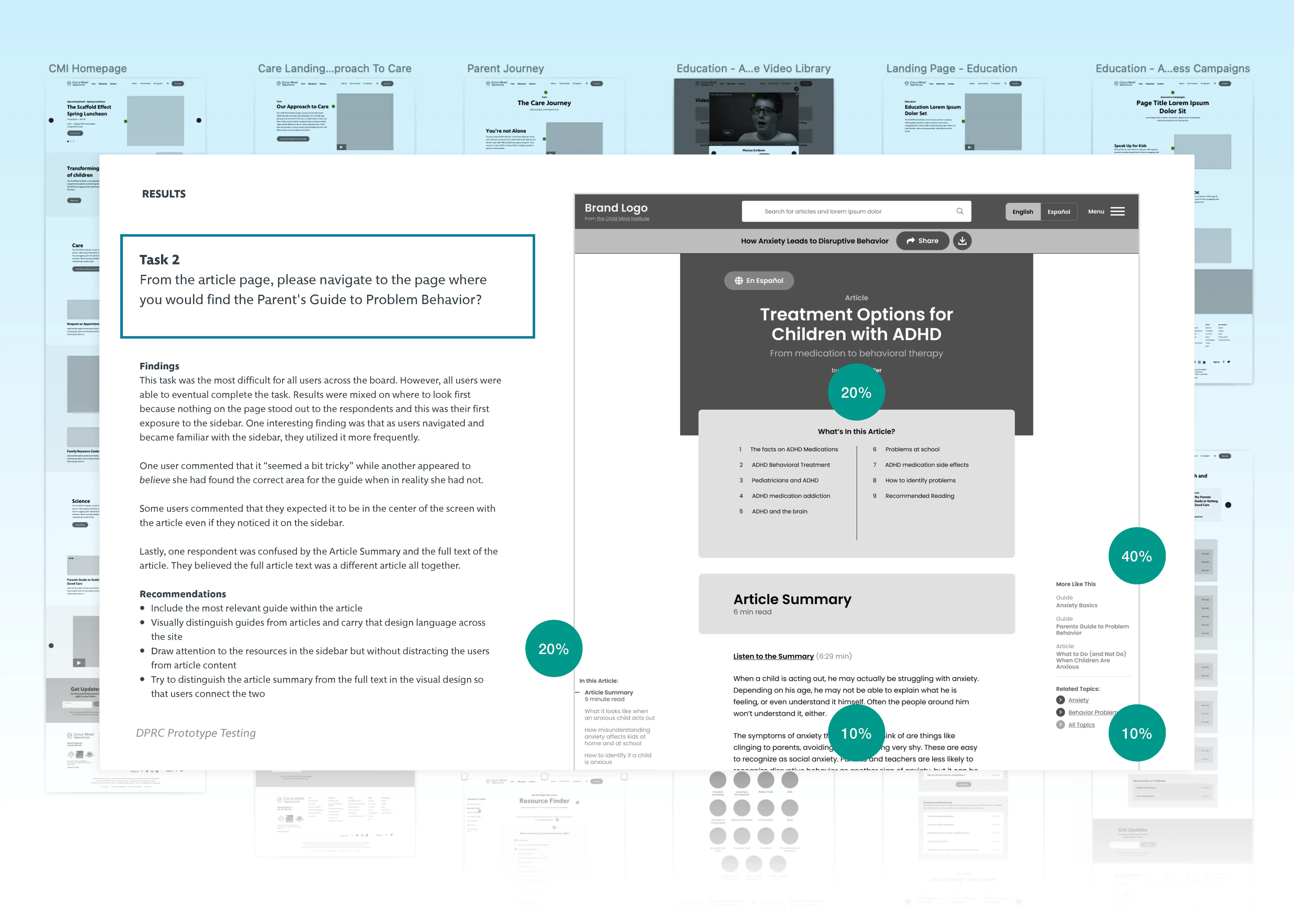
Usability Testing with real users can quickly reveal issues. I ran several rounds of usability testing on a figma prototype to mitigate potential risk and points of confusion with real users before committing to a full website build. I firmly believe that user testing early in the wireframing process creates better products in the long run.
Cross-Team Collaboration led to a Flexible Multilingual Information Architecture. After performing a thorough audit of over 2,000 articles and guides, I created a new spreadsheet that outlines new and existing post-type and taxonomies that helped stakeholders and development better understand what content needed to be created or migrated from the old site. Since a major project goal was to create a more welcoming experience to Latin families, I worked directly with the Child Mind’s Editorial team to build out the CMS’s flexibility to include Spanish fields so the team could customize automatic translations to ensure content felt authentic to native-Spanish families.
Self-service Pathways turn anxiety into empowerment. A major UX consideration of the redesign was to create a definitive landing page that acts as a self-service pathway that helps serve a high volume of anxious users efficiently. The hero features a prominent search field that includes popular topics when users interact with the field which eases users who aren’t sure where to start. I was intentional in choosing imagery throughout the site that felt like candid moments that would appeal to more diverse families.
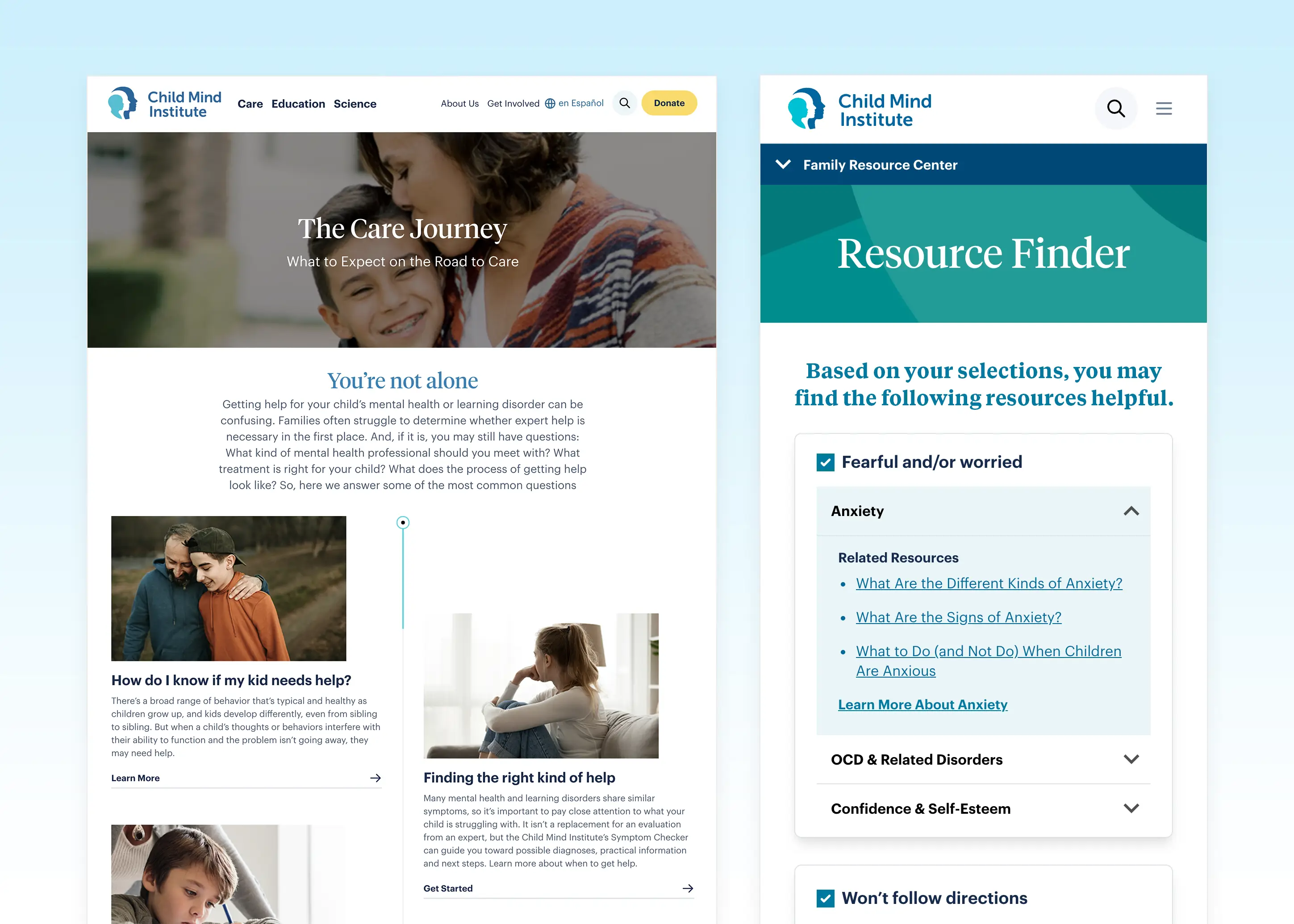
Translate user empathy into structured, scalable interface decisions. I created two new features the Care Journey landing page and Resource Finder tool to solve the core UX challenge of helping worried parents navigate complex, emotionally sensitive information without feeling overwhelmed.
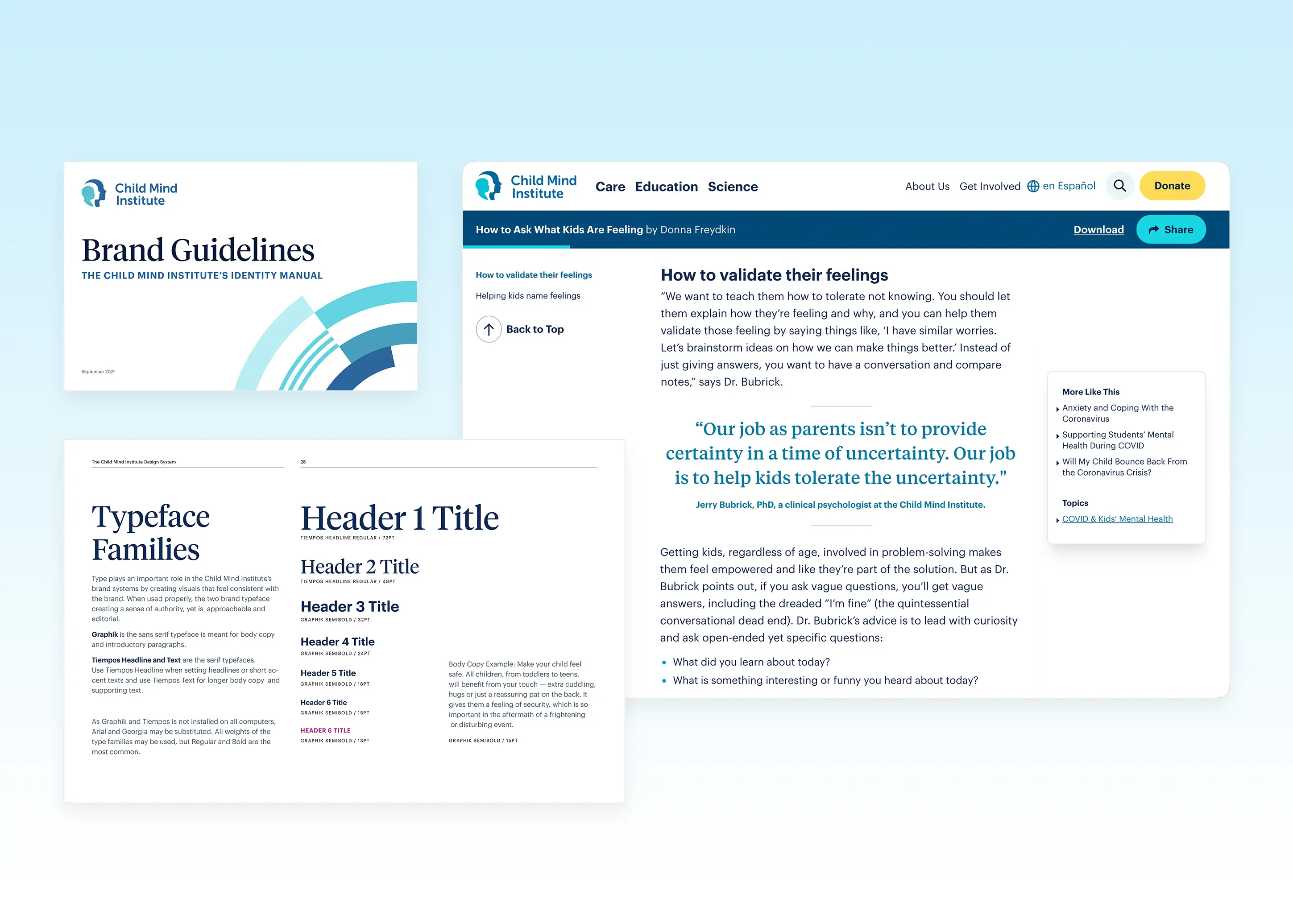
Versatile Type System that Creates Editorial Credibility. After several collaborative conversations with the Child Mind team about the brand attributes, I selected two type families that balanced the brand’s credibility while still feeling approachable and fun. I created a supporting Brand Guideline that outlined typography hierarchy and usage for the internal team to refer back to when creating future communication.
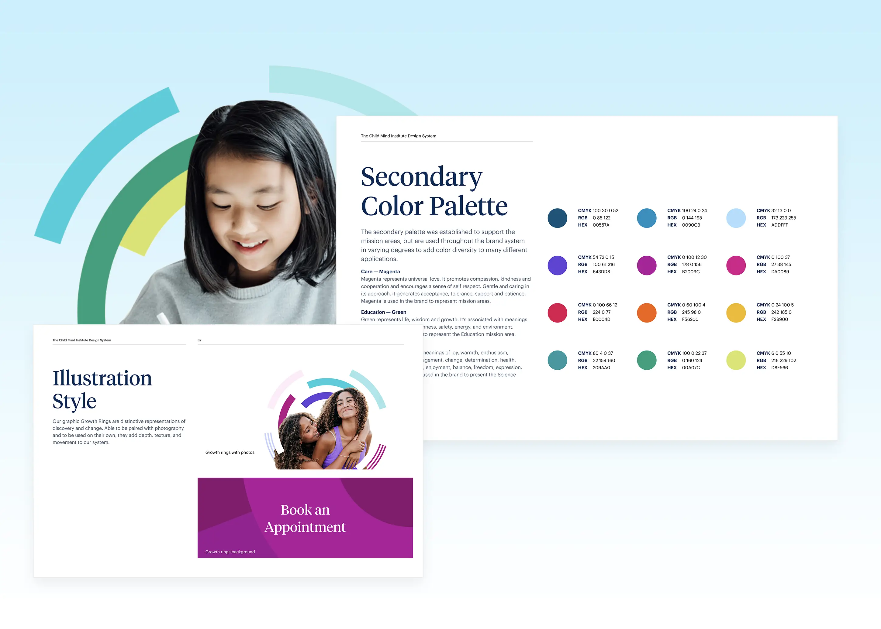
A Flexible Design System that brings the brand to life. I overhauled their design system which included an extensive color palette and an expressive new illustration style called ‘Growth Rings’. The design system is bright and optimistic while still feeling rational and evidence-based. The consistent visual identity across the entire website reinforces credibility at every touchpoint.
Doug Knapton
About
A Flexible Design System that brings the brand to life.
Role
Senior Designer
Agency
Constructive
Scope
User Research
Information Architecture
Usability Testing
Website Design
Brand Refresh
Context
The resource product had grown difficult to navigate for the families who needed it most to find help quickly.
The Child Mind Institute is a nonprofit connecting families to children's mental health resources. With over 2,000 guides and resources, the resource product had grown difficult to navigate for the families who needed it most to find help quickly.
As Lead UX/UI Designer, I owned the end-to-end process from user journey mapping to component-level execution, and led a full overhaul of the brand's visual identity. The goal was to redesign the platform to be more intuitive and inclusive, so more families could easily take the crucial next step of requesting an appointment. A key focus was expanding reach to underserved communities like rural, low-income, and Latinx families who often face the greatest barriers to accessing mental health support.
Post Launch Results
486% Increase in Appointment Requests Page Views
New and returning users are 486% more likely to visit the Request for an Appointment form, directly translating to an increased number of conversions for clinical care.
+14.9% Expanded Reach to Spanish-Speaking Audiences
The site experienced a +14.9% increase in visits from Spanish-speaking users, demonstrating enhanced inclusivity and broader reach.
31% Faster Web Performance
Page load times improved by 31%, contributing to better user satisfaction and SEO.
Strategy Roots future design decisions back to real user and business outcomes. I synthesized stakeholder input into a strategic roadmap for success metrics across departments spanning Editorial, Engineering, Marketing, and Development.
The Challenge
The design process began with understanding the user's emotional state.
I developed several user journey maps backed by analytics that traced different personas’ paths from real-world parenting concerns to booking an appointment at Child Mind Institute.
It was during the stakeholder workshops that a stark, qualified pain point arose: "95% of people aren't going to make an appointment."
Rather than treating this as an acceptable outcome, I used it as a design brief, asking directly, "How can the design increase the rate?" which led us to brainstorming UX solutions on how to bridge a critical mid-journey user pain point between reading an article and actually booking an appointment.
User Journey Maps grounding the entire UX practice in empathy rather than assumption. This flow charts a parent coming to the site from social media to reaching out to book an appointment.
The Process
Rapid testing new features that would help empower families on their care journey
After doing initial user research on the current site's analytics and mapping user journeys, it was time to start creating wireframe prototypes to test some new features that would help empower families to receive the care they needed. Since this website redesign was grounded in service design, it was crucial to do user usability testing to ensure the new features and user flow were intuitive before investing too many resources. Another consideration to keep the project on track was aligning on how to simplify the reusable component library during the wireframe stage.
Usability Testing with real users can quickly reveal issues. I ran several rounds of usability testing on a figma prototype to mitigate potential risk and points of confusion with real users before committing to a full website build. I firmly believe that user testing early in the wireframing process creates better products in the long run.
Cross-Team Collaboration led to a Flexible Multilingual Information Architecture. After performing a thorough audit of over 2,000 articles and guides, I created a new spreadsheet that outlines new and existing post-type and taxonomies that helped stakeholders and development better understand what content needed to be created or migrated from the old site. Since a major project goal was to create a more welcoming experience to Latin families, I worked directly with the Child Mind’s Editorial team to build out the CMS’s flexibility to include Spanish fields so the team could customize automatic translations to ensure content felt authentic to native-Spanish families.
Self-service Pathways turn anxiety into empowerment. A major UX consideration of the redesign was to create a definitive landing page that acts as a self-service pathway that helps serve a high volume of anxious users efficiently. The hero features a prominent search field that includes popular topics when users interact with the field which eases users who aren’t sure where to start. I was intentional in choosing imagery throughout the site that felt like candid moments that would appeal to more diverse families.
Translate user empathy into structured, scalable interface decisions. I created two new features the Care Journey landing page and Resource Finder tool to solve the core UX challenge of helping worried parents navigate complex, emotionally sensitive information without feeling overwhelmed.
Versatile Type System that Creates Editorial Credibility. After several collaborative conversations with the Child Mind team about the brand attributes, I selected two type families that balanced the brand’s credibility while still feeling approachable and fun. I created a supporting Brand Guideline that outlined typography hierarchy and usage for the internal team to refer back to when creating future communication.
A Flexible Design System that brings the brand to life. I overhauled their design system which included an extensive color palette and an expressive new illustration style called ‘Growth Rings’. The design system is bright and optimistic while still feeling rational and evidence-based. The consistent visual identity across the entire website reinforces credibility at every touchpoint.