
Brand Design Designed the Brand Identity for the Spin-off from Stanford into an Independent Nonprofit.
Role
Senior Designer
My Contribution
Logo Design
Brand Identity
Collateral Design
Motion Graphics
Agency
Constructive
Project Recognition
Communicator Award for Brand Redesign, Excellence (2025)
Context
Stanford History Education Group needed a new brand identity and website to signal their strategic transition away from Stanford University into an independent nonprofit focusing on digital literacy in the era of AI. The new visual identity needed to carry forward years of brand credibility amongst loyal educators for their free curriculum library of 14 million downloads. The key success metric for the rebrand was to communicate the transition without confusing or alientating loyal audience.
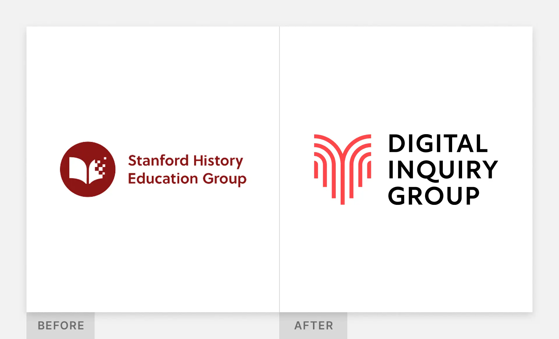
Logo design: The new system is anchored by a reimagined open-book mark that is evocative of their new tagline “dig deeper”. The logomark takes visual cues from their renowned strategy of lateral reading, a technique of referencing multiple sources to form a more comprehensive perspective. Each stroke within the logo is a reference point with the larger book shape only coming into focus when viewing all the lines together. The technique of lateral reading is essential for teaching young people about how to engage with digital media in the age of misinformation and instant answers.

Design system: I expanded the logo’s rationale into a larger brand guidelines and design system that included an expanded WCAG-compliant color palette, typographic header styles, custom brand image treatments, and photography guidance. I stress-tested the design system by applying it across a full suite of print collateral and social media templates. I also created a brand book outlining their brand messaging platform to help the DIG team communicate successfully about the new brand identity.

Website Design: instead of a full website redesign, we updated the website’s components with updated header styles, accessible color combinations, and visual brand flourishes like background textures and extenuated rounded corners on page headers that mimic the logo design.
Outcomes
The fully independent Digital Inquiry Group successfully launched on time with an updated brand identity and new website.
+3 million curriculum downloads since launch in early 2024 (bringing the total to 17 million downloads)
The logo has been widely well received as an evolution of the organization
DIG has received multiple press mentions from The Atlantic, NYT, WSJ, and a shoutout from Robert R. Newlen, Acting Librarian of Congress.
Next Case Study
Brand Design Designed the Brand Identity for the Spin-off from Stanford into an Independent Nonprofit.
Role
Senior Designer
Agency
Constructive
My Contribution
Logo Design
Brand Identity
Collateral Design
Motion Graphics
Project Recognition
Communicator Award for Brand Redesign, Excellence (2025)
Context
Stanford History Education Group needed a new brand identity and website to signal their strategic transition away from Stanford University into an independent nonprofit focusing on digital literacy in the era of AI. The new visual identity needed to carry forward years of brand credibility amongst loyal educators for their free curriculum library of 14 million downloads. The key success metric for the rebrand was to communicate the transition without confusing or alientating loyal audience.
Logo design: The new system is anchored by a reimagined open-book mark that is evocative of their new tagline “dig deeper”. The logomark takes visual cues from their renowned strategy of lateral reading, a technique of referencing multiple sources to form a more comprehensive perspective. Each stroke within the logo is a reference point with the larger book shape only coming into focus when viewing all the lines together. The technique of lateral reading is essential for teaching young people about how to engage with digital media in the age of misinformation and instant answers.
Design system: I expanded the logo’s rationale into a larger brand guidelines and design system that included an expanded WCAG-compliant color palette, typographic header styles, custom brand image treatments, and photography guidance. I stress-tested the design system by applying it across a full suite of print collateral and social media templates. I also created a brand book outlining their brand messaging platform to help the DIG team communicate successfully about the new brand identity.
Website Design: instead of a full website redesign, we updated the website’s components with updated header styles, accessible color combinations, and visual brand flourishes like background textures and extenuated rounded corners on page headers that mimic the logo design.
Outcomes
The fully independent Digital Inquiry Group successfully launched on time with an updated brand identity and new website.
+3 million curriculum downloads since launch in early 2024 (bringing the total to 17 million downloads)
The logo has been widely well received as an evolution of the organization
DIG has received multiple press mentions from The Atlantic, NYT, WSJ, and a shoutout from Robert R. Newlen, Acting Librarian of Congress.