Doug Knapton Creates

Doug Knapton Creates

Trusted

Trusted

Trusted

Brand Identities

Powered by

Visual Storytelling

His strategic approach combines extensive user research, iterative testing, and data-driven design decisions to deliver solutions that increase conversions, improve accessibility, and strengthen brand recognition. Doug's work has reached over 1 billion people globally and has been recognized by the Webby Awards, Fast Company's Innovation by Design, Indigo Design Award, and Anthem Awards.
Case Study

FrameWorks Institute

5 Years of Brand Expressions

Role

Lead Brand Designer

Services

Design Production, Motion Graphics

Agency

Constructive

Case Study

FrameWorks Institute

5 Years of Brand Expressions

Role

Lead Brand Designer

Services

Design Production, Motion Graphics

Agency

Constructive

Case Study

FrameWorks Institute

5 Years of Brand Expressions

Role

Lead Brand Designer

Services

Design Production, Motion Graphics

Agency

Constructive

Context

I served as Lead Designer for FrameWorks Institute account over a 5-year contract while at Constructive. I defined the brand evolution across every touchpoint from the creation of their unique collage art style, production of over 50+ data-driven research reports, several explainer videos series, and eventually leading and mentored a team of 4 designers, owning creative direction and QA. 

I scaled design operations by instituting weekly team standup, building and maintaining flexible editorial templates, and creating a freelancer onboarding system which streamlined workflows and enabled rapid, high-quality delivery.

The Challenge

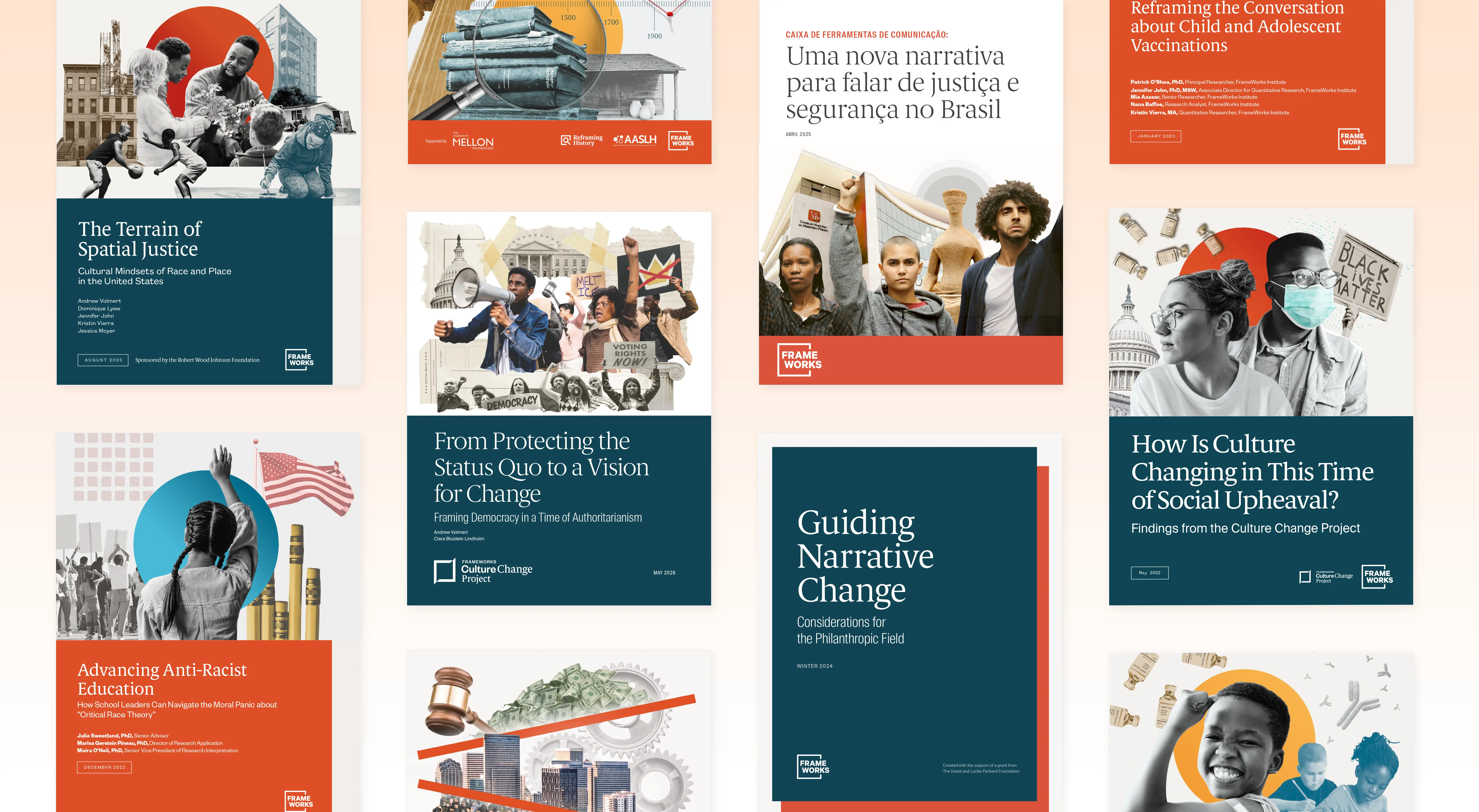
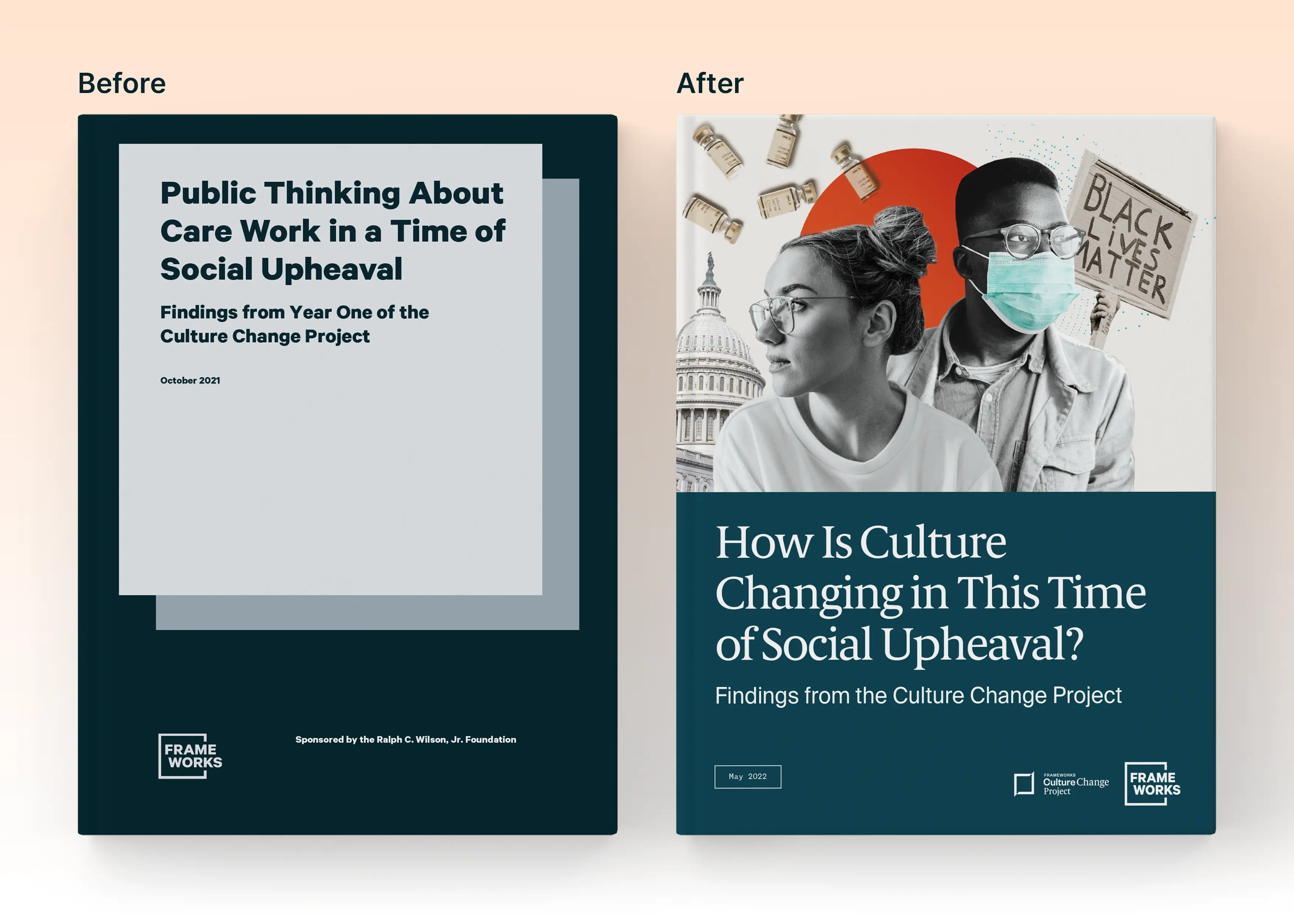
When I first started working with FrameWorks Institute, the first thing I noticed was that all of their research reports used the same template in order to save time on production work. Their research wasn’t getting the attention it deserved because all the report covers looked the same. I saw this as an opportunity to propose a more visual approach to their cover. The collage style came from a series of conversations with the FrameWorks team about how their research needed a multi-faceted visual storytelling approach that expanded beyond a single image since effective framing often involves a systematic mindset over an individualistic focus. Social issues should not be depicted as the work of a single person, which is why the college system is successful for taking certain aspects of the topic and juxtaposing them together to tell a more nuanced story.

Context

I served as Lead Designer for FrameWorks Institute account over a 5-year contract while at Constructive. I defined the brand evolution across every touchpoint from the creation of their unique collage art style, production of over 50+ data-driven research reports, several explainer videos series, and eventually leading and mentored a team of 4 designers, owning creative direction and QA. 

I scaled design operations by instituting weekly team standup, building and maintaining flexible editorial templates, and creating a freelancer onboarding system which streamlined workflows and enabled rapid, high-quality delivery.

The Challenge

When I first started working with FrameWorks Institute, the first thing I noticed was that all of their research reports used the same template in order to save time on production work. Their research wasn’t getting the attention it deserved because all the report covers looked the same. I saw this as an opportunity to propose a more visual approach to their cover. The collage style came from a series of conversations with the FrameWorks team about how their research needed a multi-faceted visual storytelling approach that expanded beyond a single image since effective framing often involves a systematic mindset over an individualistic focus. Social issues should not be depicted as the work of a single person, which is why the college system is successful for taking certain aspects of the topic and juxtaposing them together to tell a more nuanced story.

Context

I served as Lead Designer for FrameWorks Institute account over a 5-year contract while at Constructive. I defined the brand evolution across every touchpoint from the creation of their unique collage art style, production of over 50+ data-driven research reports, several explainer videos series, and eventually leading and mentored a team of 4 designers, owning creative direction and QA. 

I scaled design operations by instituting weekly team standup, building and maintaining flexible editorial templates, and creating a freelancer onboarding system which streamlined workflows and enabled rapid, high-quality delivery.

The Challenge

When I first started working with FrameWorks Institute, the first thing I noticed was that all of their research reports used the same template in order to save time on production work. Their research wasn’t getting the attention it deserved because all the report covers looked the same. I saw this as an opportunity to propose a more visual approach to their cover. The collage style came from a series of conversations with the FrameWorks team about how their research needed a multi-faceted visual storytelling approach that expanded beyond a single image since effective framing often involves a systematic mindset over an individualistic focus. Social issues should not be depicted as the work of a single person, which is why the college system is successful for taking certain aspects of the topic and juxtaposing them together to tell a more nuanced story.

Fig 01

Before and After. The custom collage imagery acts as a visual throughline reinforcing brand consistency across a growing library of research. The cover has to signal credibility to professional audiences while still feeling human, urgent, and worth opening.
Outcomes

Editorial Design that make complex ideas tangible. I created over 50+ longform reports for FrameWorks and their partners. The editorial design system is built to make complex research tangible to nonprofit and advocacy audiences. I built out the cohesive visual language for data visualizations, sample communication recommendations, and system change diagrams.

Outcomes

Editorial Design that make complex ideas tangible. I created over 50+ longform reports for FrameWorks and their partners. The editorial design system is built to make complex research tangible to nonprofit and advocacy audiences. I built out the cohesive visual language for data visualizations, sample communication recommendations, and system change diagrams.

Outcomes

Editorial Design that make complex ideas tangible. I created over 50+ longform reports for FrameWorks and their partners. The editorial design system is built to make complex research tangible to nonprofit and advocacy audiences. I built out the cohesive visual language for data visualizations, sample communication recommendations, and system change diagrams.

Fig 02

The goal of Editorial Design was to make longform behavioral information feel approachable and human without losing its rigor.

Fig 03

Culture Change Project Branding and Presentation Design. Showcase of the branding and report design I created for FrameWorks Institute's Culture Change Project, an ongoing research initiative tracking how Americans' mindsets shift over time. The core design challenge was creating a sub-brand system that could be its own district identity and push boundaries, while living within the FrameWorks brand. The Culture Change Project shifting brackets logo acts as a unique design motif throughout the reports’ photo illustrations and page layouts to visually reinforce the idea of “framing” in everyday life.
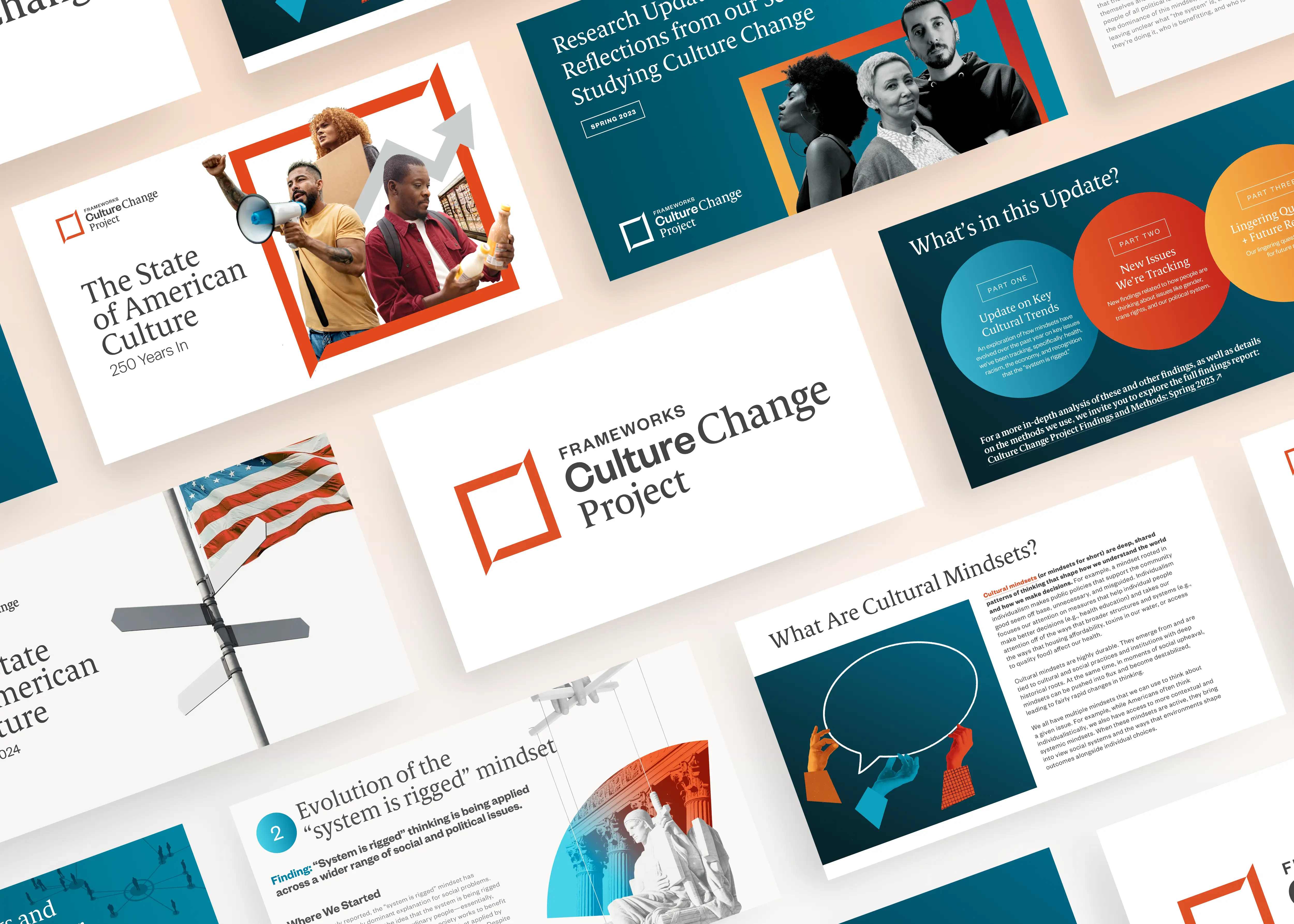
Fig 04

‘Fast Frames’ Motion Graphics Video Series. Key artwork stills from a motion graphics and video series I designed and animated for the FrameWorks Institute. I collaborated closely with the FrameWorks team to develop storyboards that properly visualized complex communication recommendations covering topics from public health communications to unpacking cultural mindsets.

The challenge was to build a unified motion system flexible enough to include talking-head interviews, animated explainer graphics, and animated typography treatments. I developed a series of custom iconography that gives abstract concepts like individualism and fatalism a recurring visual vocabulary. Across the whole series, the goal was to make dense behavioral science and narrative-change research feel human, watchable, and shareable.
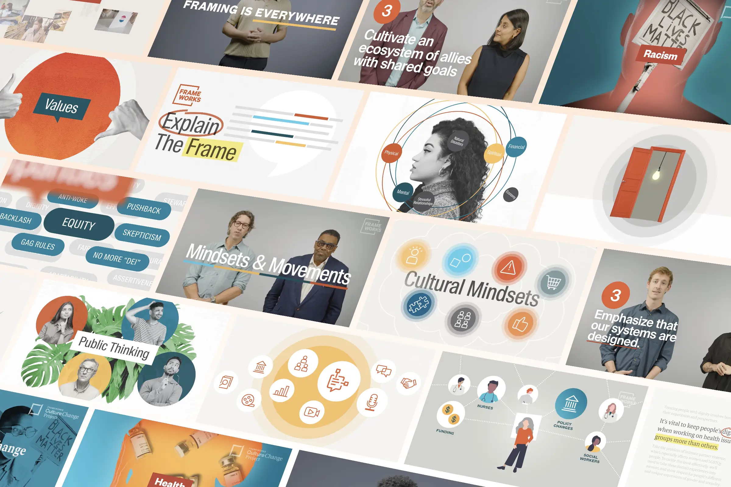


Fig 05

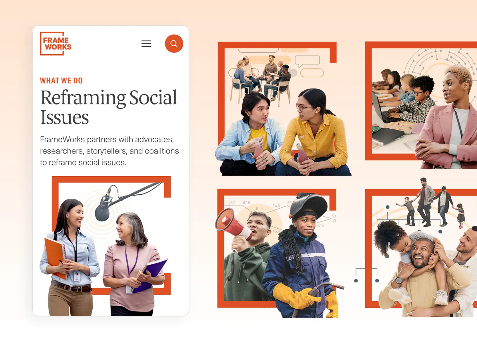
Web Illustration that establish a credible tone from the first scroll. A set of custom issue area illustrations I designed for the FrameWorks Institute website. The challenge was creating over 30+ consistent illustrations that followed the same visual language. Each illustration layers photography with the brand's signature frame and subtle conceptual line-art. The layering of elements gives every illustration a sense of depth and movement.
Reflections

Brand Design should evolve over time. Since the project span five years, there were moments where I got the chance to reflect on where the design system was and how it needed to evolve. One of those pivotal moments was updating the typefaces midway through the contract. We had initially proposed a sans serif that had a bit more funky characteristics that acted as a brand differentiator, but we realized it was the wrong font for a brand that needs a workhorse font that communicates authority and is also extremely legible in long research reports. Changing fonts required a lot of conversations between the project team, but was ultimately the right move to reflect FrameWork’s rigorous expertise. 

Collaboration takes time, but it’s worth the hassle. Leaning into visual storytelling meant I had to align more with the team to push ambitious ideas along. Creating custom collages meant having to source more imagery and working closer with the authors to make sure the research was effectively communicated. That sensitivity expanded tenfold when it came to conceptualizing the motion graphics videos. I iterated on several rounds of storyboards before animation even began to align on how we were visualizing complex ideas like individualism and fatalism. At the end of the day, those moments of intense collaboration felt most rewarding because what we built together outshined what any of us could have made alone.

Reflections

Brand Design should evolve over time. Since the project span five years, there were moments where I got the chance to reflect on where the design system was and how it needed to evolve. One of those pivotal moments was updating the typefaces midway through the contract. We had initially proposed a sans serif that had a bit more funky characteristics that acted as a brand differentiator, but we realized it was the wrong font for a brand that needs a workhorse font that communicates authority and is also extremely legible in long research reports. Changing fonts required a lot of conversations between the project team, but was ultimately the right move to reflect FrameWork’s rigorous expertise. 

Collaboration takes time, but it’s worth the hassle. Leaning into visual storytelling meant I had to align more with the team to push ambitious ideas along. Creating custom collages meant having to source more imagery and working closer with the authors to make sure the research was effectively communicated. That sensitivity expanded tenfold when it came to conceptualizing the motion graphics videos. I iterated on several rounds of storyboards before animation even began to align on how we were visualizing complex ideas like individualism and fatalism. At the end of the day, those moments of intense collaboration felt most rewarding because what we built together outshined what any of us could have made alone.

Reflections

Brand Design should evolve over time. Since the project span five years, there were moments where I got the chance to reflect on where the design system was and how it needed to evolve. One of those pivotal moments was updating the typefaces midway through the contract. We had initially proposed a sans serif that had a bit more funky characteristics that acted as a brand differentiator, but we realized it was the wrong font for a brand that needs a workhorse font that communicates authority and is also extremely legible in long research reports. Changing fonts required a lot of conversations between the project team, but was ultimately the right move to reflect FrameWork’s rigorous expertise. 

Collaboration takes time, but it’s worth the hassle. Leaning into visual storytelling meant I had to align more with the team to push ambitious ideas along. Creating custom collages meant having to source more imagery and working closer with the authors to make sure the research was effectively communicated. That sensitivity expanded tenfold when it came to conceptualizing the motion graphics videos. I iterated on several rounds of storyboards before animation even began to align on how we were visualizing complex ideas like individualism and fatalism. At the end of the day, those moments of intense collaboration felt most rewarding because what we built together outshined what any of us could have made alone.

Case Study

The Climate Trust

A Timeless Mark for Better Land Stewardship

Role

Lead Brand Designer

Services

Visual Identity, Web Design

Agency

Constructive

Case Study

The Climate Trust

A Timeless Mark for Better Land Stewardship

Role

Lead Brand Designer

Services

Visual Identity, Web Design

Agency

Constructive

Case Study

The Climate Trust

A Timeless Mark for Better Land Stewardship

Role

Lead Brand Designer

Services

Visual Identity, Web Design

Agency

Constructive

The Challenge

The Climate Trust needed a new brand and website that positioned the organization as an established landowner-first nonprofit in the crowded carbon-market field of tech startups. 

The main challenge was how to serve two very different audiences of landowners/rural communities and investors without diluting either message. There is a perception among landowners who are wary of Silicon Valley climate tech so the new brand messaging needed to be trustworthy and boots-on-the-ground.

Strategy

Since the new brand had to feel warm and grounded, I took inspiration directly from nature.

The Challenge

The Climate Trust needed a new brand and website that positioned the organization as an established landowner-first nonprofit in the crowded carbon-market field of tech startups. 

The main challenge was how to serve two very different audiences of landowners/rural communities and investors without diluting either message. There is a perception among landowners who are wary of Silicon Valley climate tech so the new brand messaging needed to be trustworthy and boots-on-the-ground.

Strategy

Since the new brand had to feel warm and grounded, I took inspiration directly from nature.

The Challenge

The Climate Trust needed a new brand and website that positioned the organization as an established landowner-first nonprofit in the crowded carbon-market field of tech startups. 

The main challenge was how to serve two very different audiences of landowners/rural communities and investors without diluting either message. There is a perception among landowners who are wary of Silicon Valley climate tech so the new brand messaging needed to be trustworthy and boots-on-the-ground.

Strategy

Since the new brand had to feel warm and grounded, I took inspiration directly from nature.

Fig 01

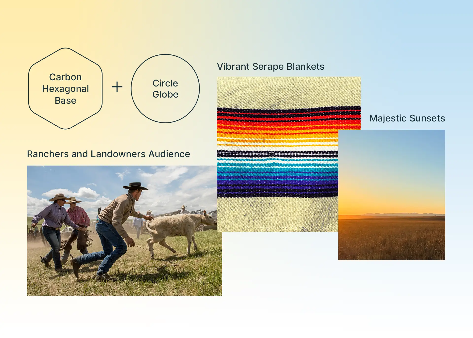
A Timeless Logo Design that Demands Attention. I created the structure of the logo by interlocking the hexagonal structure of carbon with a circle that represents the globe. The logo is a reminder of how carbon markets are an interconnected nature-based solution for tackling climate change. Its simplicity and geometry feels both timeless and elegant.

Fig 02

Nature Inspired Color Palette. The color palette is anchored in earth tones with the logo’s gradient inspired by the majesty of a sunset sky over a vast landscape. The brand identity celebrates nature’s inherent transcendentalism rather than appealing to any trends.
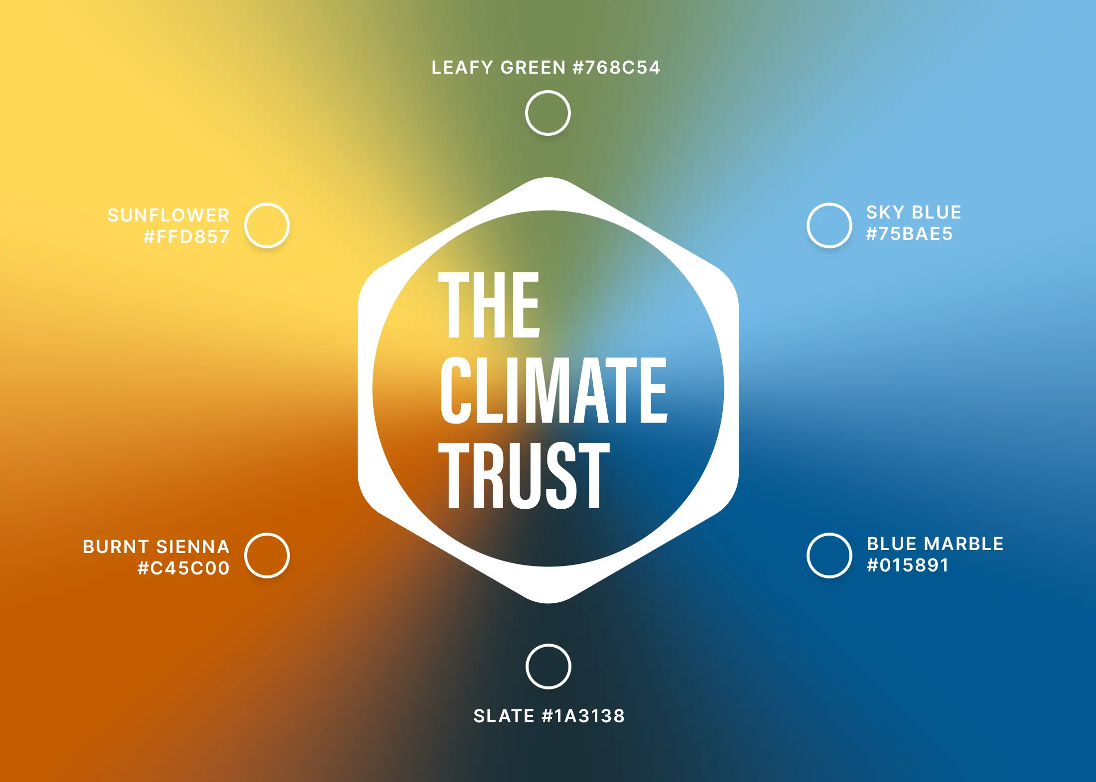
Fig 03

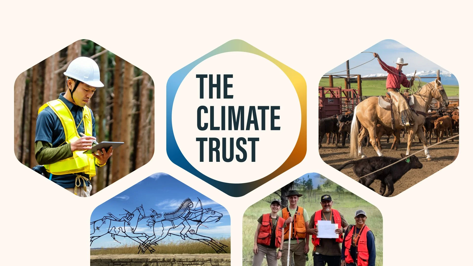
Real Project Photography Depicts Real Solutions. I also directed a photography strategy for capturing real photos of landowners to visually demonstrate what good land stewardship can be for a better climate. Each photo is a chance to show how nature-based projects can benefit both people and the climate.
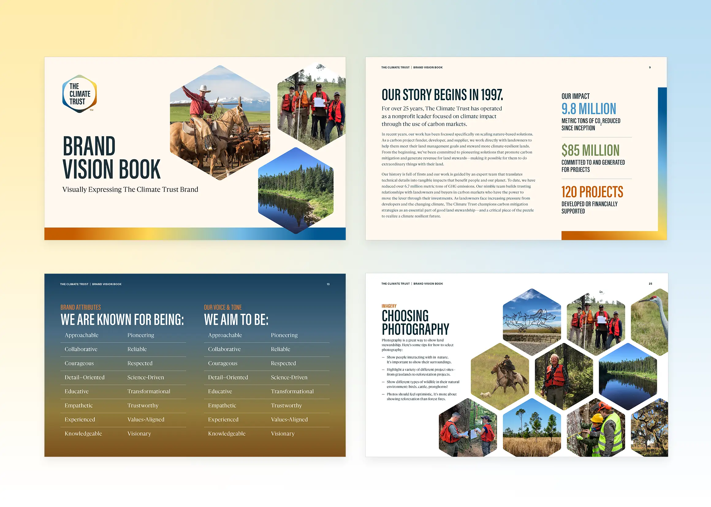
Fig 03

Bold Typography Grounded the Experience. I selected typefaces that feel accessible and warm to support the brand’s “approachable expert” attribute. I also introduced a bolder condensed san-serif that allows for more urgent climate messaging.
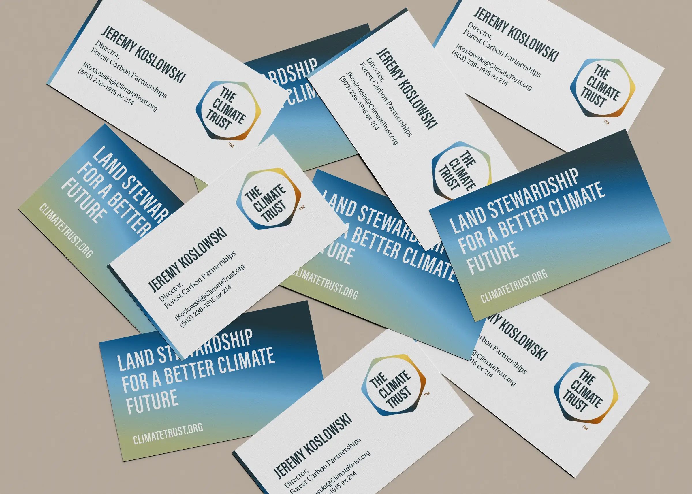
Fig 03

Visualizations Helped Clarify Carbon Complexity. I developed a series of illustrated infographics and stepped process visualizations to act as core storytelling devices that simplified Climate Trust’s technically complex offerings.

Fig 03

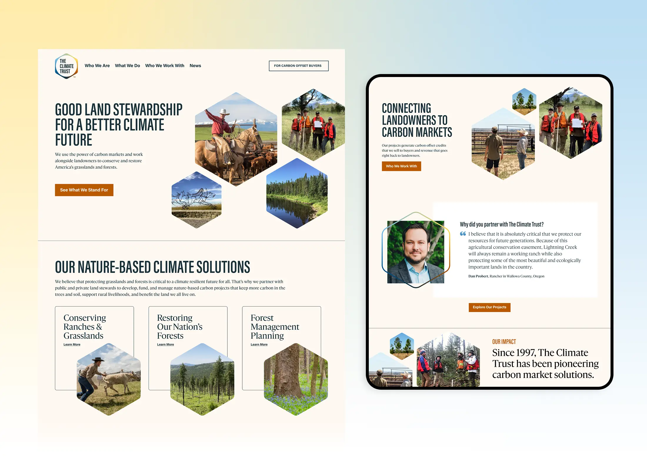
Website Strategy needed to be Audience-centered. I structured the website navigation and content strategy around their different audiences to ensure each audience reached relevant information with minimal clicks.
Outcomes

The new brand has been warmly embraced by both the staff and their partners. The new design system has amplified the team’s voice, influence and thought leadership online and at live events. 

The Climate Trust’s website won a W3 Award in 2024 for the Environmental & Sustainability category.

Outcomes

The new brand has been warmly embraced by both the staff and their partners. The new design system has amplified the team’s voice, influence and thought leadership online and at live events. 

The Climate Trust’s website won a W3 Award in 2024 for the Environmental & Sustainability category.

Outcomes

The new brand has been warmly embraced by both the staff and their partners. The new design system has amplified the team’s voice, influence and thought leadership online and at live events. 

The Climate Trust’s website won a W3 Award in 2024 for the Environmental & Sustainability category.

Case Study

Digital Inquiry Group

Dig Deeper

Role

Lead Brand Designer

Services

Visual Identity, Web Design

Agency

Constructive

Case Study

Digital Inquiry Group

Dig Deeper

Role

Lead Brand Designer

Services

Visual Identity, Web Design

Agency

Constructive

Case Study

Digital Inquiry Group

Dig Deeper

Role

Lead Brand Designer

Services

Visual Identity, Web Design

Agency

Constructive

The Challenge

Stanford History Education Group needed a new brand identity and website to signal their strategic transition away from Stanford University into an independent nonprofit focusing on digital literacy in the era of AI. The new visual identity needed to carry forward years of brand credibility amongst loyal educators for their free curriculum library of 14 million downloads. The key success metric for the rebrand was to communicate the transition without confusing or alientating loyal audience.

The Challenge

Stanford History Education Group needed a new brand identity and website to signal their strategic transition away from Stanford University into an independent nonprofit focusing on digital literacy in the era of AI. The new visual identity needed to carry forward years of brand credibility amongst loyal educators for their free curriculum library of 14 million downloads. The key success metric for the rebrand was to communicate the transition without confusing or alientating loyal audience.

The Challenge

Stanford History Education Group needed a new brand identity and website to signal their strategic transition away from Stanford University into an independent nonprofit focusing on digital literacy in the era of AI. The new visual identity needed to carry forward years of brand credibility amongst loyal educators for their free curriculum library of 14 million downloads. The key success metric for the rebrand was to communicate the transition without confusing or alientating loyal audience.


Strategy

After synthesizing findings from stakeholder interviews, I defined a new, independent brand identity that honored the legacy logo rather than abandoning it outright. 

Logo design: The new system is anchored by a reimagined open-book mark that is evocative of their new tagline “dig deeper”. The logomark takes visual cues from their renowned strategy of lateral reading, a technique of referencing multiple sources to form a more comprehensive perspective. Each stroke within the logo is a reference point with the larger book shape only coming into focus when viewing all the lines together. The technique of lateral reading is essential for teaching young people about how to engage with digital media in the age of misinformation and instant answers.

Design system: i expanded the logo’s rational into a larger brand guidelines and design system that included a an expanded WCAG-compliant color palette combinations, typographic header styles, custom brand image treatments and photography guidance. I stress-tested the design system by applying it across a full suite of print collaterals and social media templates. I also created a brand book outlining their brand messaging platform to help the DIG team communicate successfully about the new brand identity.

Website Design: instead of a full website redesign, we updated the website’s components with updated header styles, accessible color combinations, and visual  brand flourishes like background textures and extenuated rounded corners on page headers that mimic the logo design.

Strategy

After synthesizing findings from stakeholder interviews, I defined a new, independent brand identity that honored the legacy logo rather than abandoning it outright. 

Logo design: The new system is anchored by a reimagined open-book mark that is evocative of their new tagline “dig deeper”. The logomark takes visual cues from their renowned strategy of lateral reading, a technique of referencing multiple sources to form a more comprehensive perspective. Each stroke within the logo is a reference point with the larger book shape only coming into focus when viewing all the lines together. The technique of lateral reading is essential for teaching young people about how to engage with digital media in the age of misinformation and instant answers.

Design system: i expanded the logo’s rational into a larger brand guidelines and design system that included a an expanded WCAG-compliant color palette combinations, typographic header styles, custom brand image treatments and photography guidance. I stress-tested the design system by applying it across a full suite of print collaterals and social media templates. I also created a brand book outlining their brand messaging platform to help the DIG team communicate successfully about the new brand identity.

Website Design: instead of a full website redesign, we updated the website’s components with updated header styles, accessible color combinations, and visual  brand flourishes like background textures and extenuated rounded corners on page headers that mimic the logo design.

Strategy

After synthesizing findings from stakeholder interviews, I defined a new, independent brand identity that honored the legacy logo rather than abandoning it outright. 

Logo design: The new system is anchored by a reimagined open-book mark that is evocative of their new tagline “dig deeper”. The logomark takes visual cues from their renowned strategy of lateral reading, a technique of referencing multiple sources to form a more comprehensive perspective. Each stroke within the logo is a reference point with the larger book shape only coming into focus when viewing all the lines together. The technique of lateral reading is essential for teaching young people about how to engage with digital media in the age of misinformation and instant answers.

Design system: i expanded the logo’s rational into a larger brand guidelines and design system that included a an expanded WCAG-compliant color palette combinations, typographic header styles, custom brand image treatments and photography guidance. I stress-tested the design system by applying it across a full suite of print collaterals and social media templates. I also created a brand book outlining their brand messaging platform to help the DIG team communicate successfully about the new brand identity.

Website Design: instead of a full website redesign, we updated the website’s components with updated header styles, accessible color combinations, and visual  brand flourishes like background textures and extenuated rounded corners on page headers that mimic the logo design.


Outcome

The fully-independent Digital Inquiry Group successfully launched on time with an updated brand identity and new website. 

+3 million curriculum downloads since launch in early 2024 (bringing the total to 17 million downloads)

The logo has been widely well recieved as an evolution of the organization

DIG has received multiple press mentions from The Atlantic, NYT, WSJ, and a shoutout from the Robert R. Newlen, Acting Librarian of Congress: “DIG’s innovative approach to promoting digital literacy by using historical documents to enchance students’ abilities to decipher misinformation and utilize primary sources serves as an inspired model.”

Outcome

The fully-independent Digital Inquiry Group successfully launched on time with an updated brand identity and new website. 

+3 million curriculum downloads since launch in early 2024 (bringing the total to 17 million downloads)

The logo has been widely well recieved as an evolution of the organization

DIG has received multiple press mentions from The Atlantic, NYT, WSJ, and a shoutout from the Robert R. Newlen, Acting Librarian of Congress: “DIG’s innovative approach to promoting digital literacy by using historical documents to enchance students’ abilities to decipher misinformation and utilize primary sources serves as an inspired model.”

Outcome

The fully-independent Digital Inquiry Group successfully launched on time with an updated brand identity and new website. 

+3 million curriculum downloads since launch in early 2024 (bringing the total to 17 million downloads)

The logo has been widely well recieved as an evolution of the organization

DIG has received multiple press mentions from The Atlantic, NYT, WSJ, and a shoutout from the Robert R. Newlen, Acting Librarian of Congress: “DIG’s innovative approach to promoting digital literacy by using historical documents to enchance students’ abilities to decipher misinformation and utilize primary sources serves as an inspired model.”

Let's Talk

I'm currently available for new projects and roles.

Feel free to contact me with the details, and I'll follow up quickly.

© Copyright 2026. All Rights Reserved by Doug Knapton

Let's Talk

I'm currently available for new projects and roles.

Feel free to contact me with the details, and I'll follow up quickly.

© Copyright 2026. All Rights Reserved by Doug Knapton

Let's Talk

I'm currently available for new projects and roles.

Feel free to contact me with the details, and I'll follow up quickly.

© Copyright 2026. All Rights Reserved by Doug Knapton