
Designed a Zero-to-One Public Data Tool on 25+ Years of Satellite Air Pollution Data
Role
Senior Designer
My Contribution
Data Visualization
Information Architecture
Usability Testing
Website Design
Brand Design
Agency
Constructive
Context
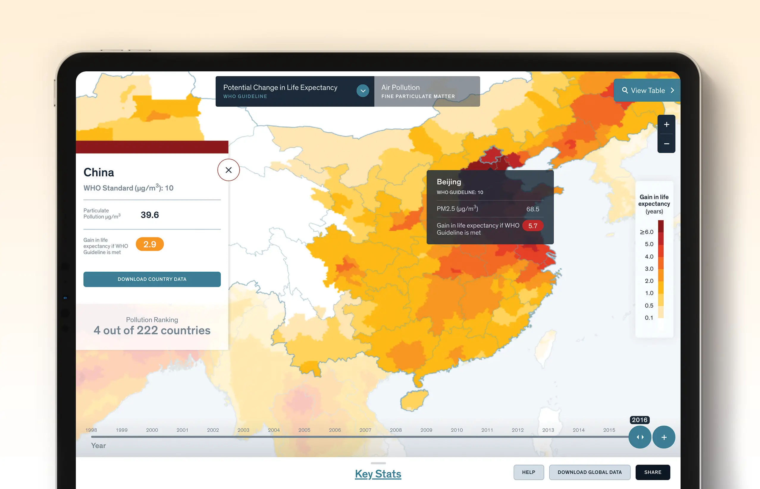
The Energy Policy Institute at the University of Chicago (EPIC) quantified the causal relationship between air pollution and life expectancy, but had a challenge with how to visualize the complex data in an engaging way that educated the public and empowered policymaker leaders with actionable insights to introduce more sustainable legislation.
As Lead UX/UI Designer, my role was to define this revolutionary zero-to-one public data product and design supporting brand expressions like research reports and explainer graphics.
The Challenge
The major constraint creating the AQLI was identifying the right technical infrastructure. I collaborated directly with a full-stack developer to identify the proper dev environment that would support 25+ years of global satellite data. The other challenge was how to educate first-time users on all of uChicago’s technical research terminology. Many first-time users during usability testing cited that they thought the index showed pollution rates, when the index actually shows “Life Years Saved if Countries Reduce their Air Pollution to meet WHO Standard.” I designed a suite of air pollution explainer visualizations to communicate the index’s more abstract metric to everyday people who are engaging with the tool.
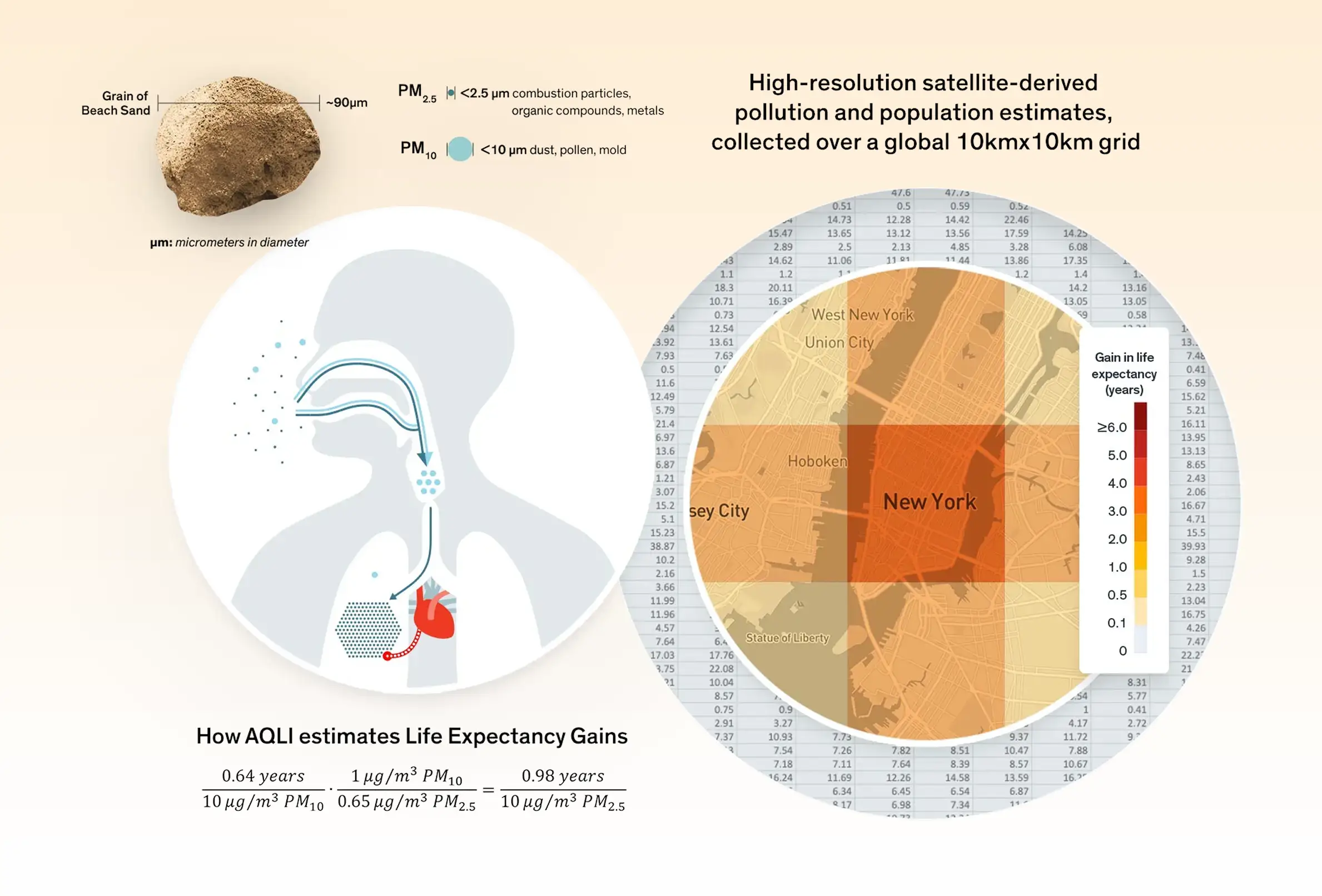
I developed these supporting graphics to better explain what particulate pollution is and how it affects human health. They appeared on the website and research reports.
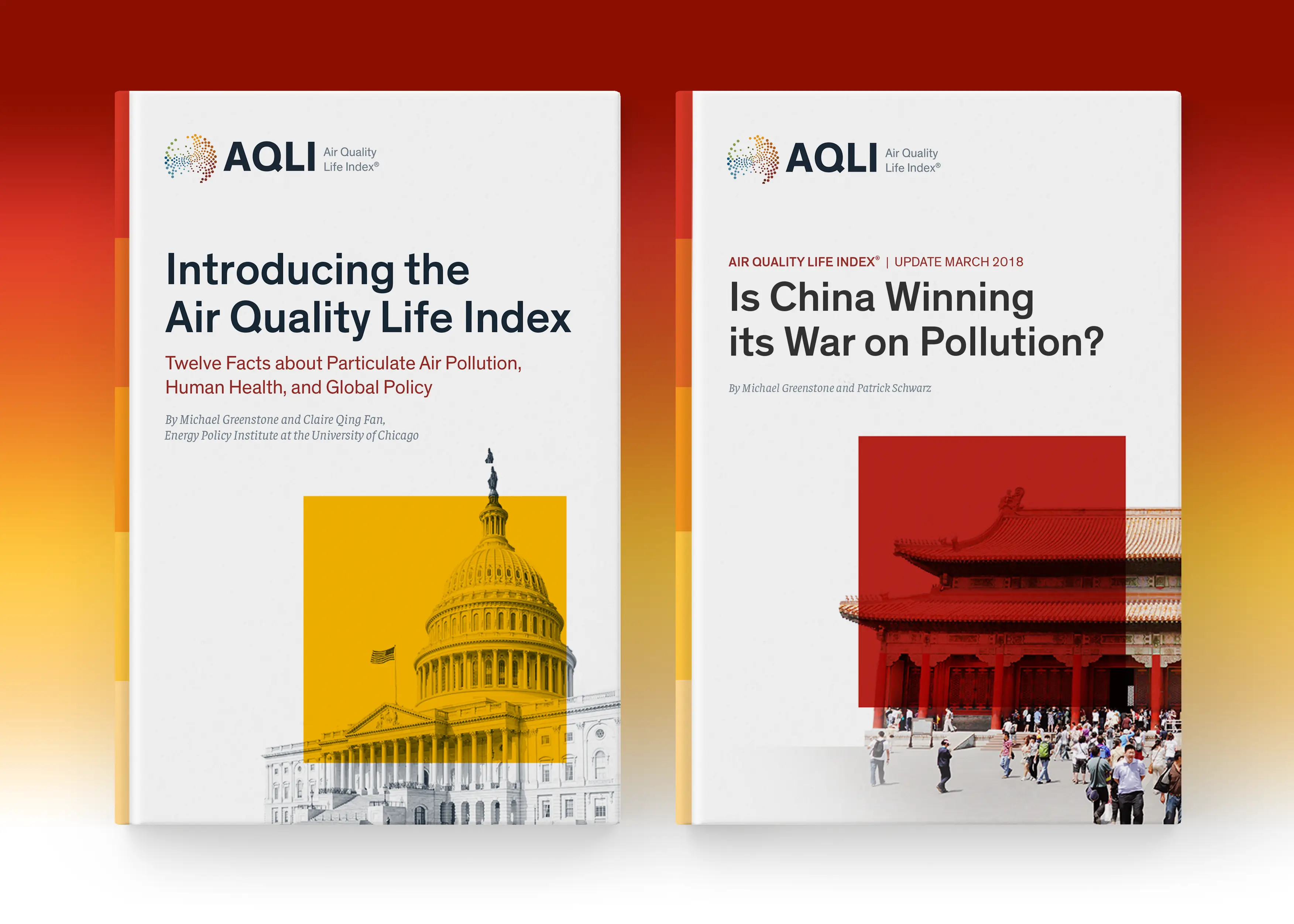
Editorial Report Design. I designed several research reports introducing the AQLI research to the public. The covers borrow the Index’s legend as a visual metaphor to show how certain countries’ air pollution stacks up against each other.
The Process
I conducted a series of three iterative rounds of user testing on a wireframe prototype to better test user assumptions and subject matter proficiency.
Some key insights were:
First-time users were initially overwhelmed and requested primer content and optional ‘get help’ walkthrough tutorials
Users asked for explanatory tooltips to better understand the visualization’s subject matter
Users needed city markers to better position themselves in the experiences (we initially only scoped for country and state/region/providence borders)

User testing was a crucial step in the process because it helped uncover a lot of biased assumptions we made as a project team because we were closer to the research and brand narrative.
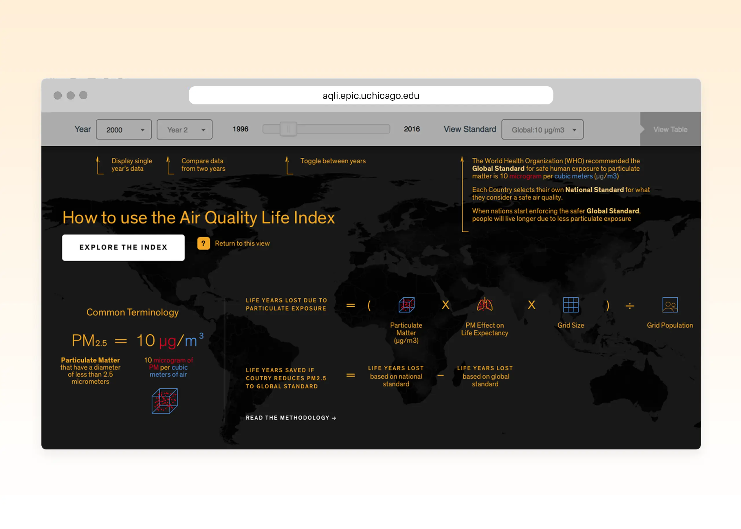
I developed this explainer modal that helped clarify the index’s legend and what it is tracking. It helped to educate first-time users on the subject matter.
Video Demo showing key functionality of the index
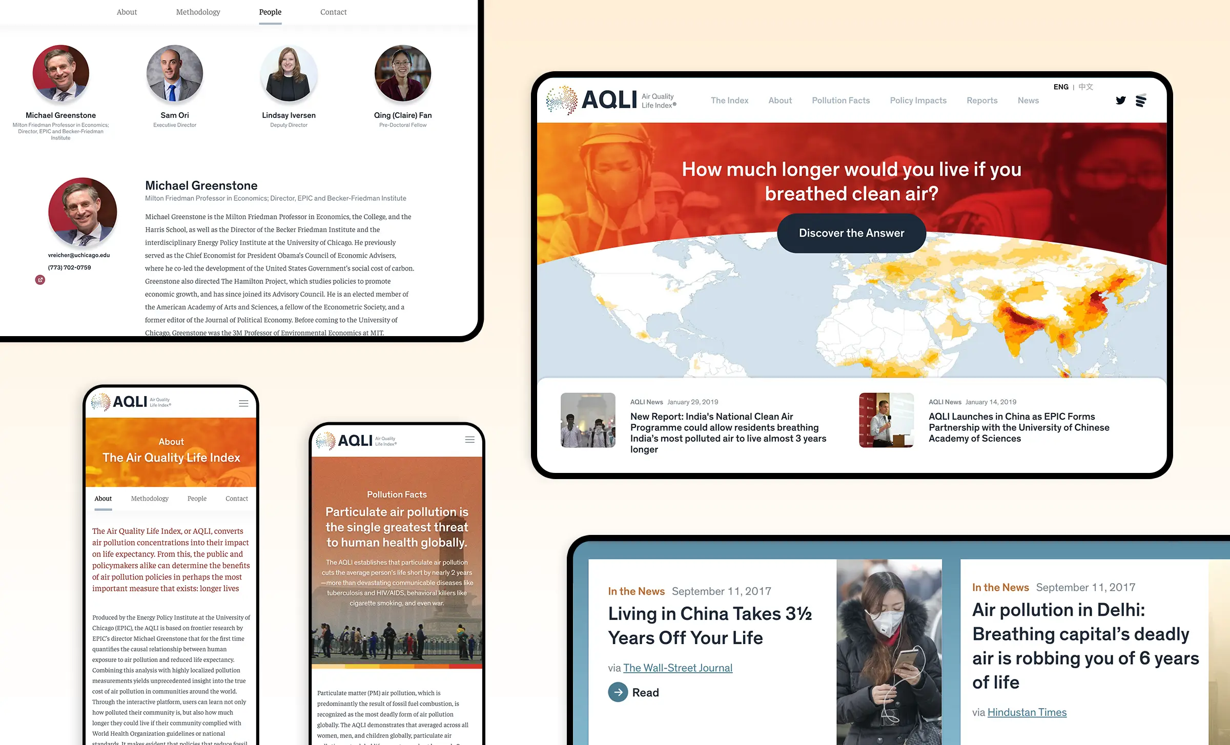
The website design mirrors the visual language established in the index. Early in the process, we quickly realized the tool would eventually have to be multilingual to support its growing interest among international policymakers. I consulted with several independent contractors to better understand how to localize the index for different languages. We relied on the Google Translate API to translate the entire site and index into Mandarin and Hindi to achieve significant reach in China, India, and Pakistan. UX Localization is a newer discipline for me, but it was endlessly fascinating.
Outcomes
The AQLI has received coverage from more than 300 media outlets, reaching more than 1.1 billion people globally in both top-tier and local outlets across print, digital, television, and radio platforms.
The AQLI has been supported by environmentalists Greta Thunberg, Leonardo DiCaprio, and Pakistan’s former Minister for Climate/Environment Sherry Rehman, and used by human rights committees in India and Human Rights Watch in Pakistan to justify action. The AQLI has helped drive the development of a clean air bill in India, and has been used to justify policy changes by Members of Parliament in the United Kingdom, India, and Pakistan. It has also been used as evidence in a landmark Indonesian court ruling that found the Jakarta government needed to do more to protect its people.
The Index has been recognized as a ‘World Changing Idea’ by Fast Company magazine and as the “gold standard on air quality research” in The New York Times.
Reflections
The data visualization needs to be an effective tool for both experts and the public. Early on in the process, I identified that the product’s different audience types needed different content and engaged with the tool differently. Everyday users were most curious about the big-picture takeaway and how their location’s air pollution compared with other places. Policy leaders needed supporting data evidence and pages explaining the methodology to help inform local legislation. I helped craft the digital strategy to outline types of content each audience would need to be an effective tool for everyone.
A truly international tool needs to be multilingual. Early in the process, we quickly realized the tool would eventually have to be multilingual to support its growing interest of international policymakers. I consulted with several independent contractors to better understand how to localize the index for different languages. We relied on Google Translate API to translate the entire site and index into Mandarin and Hindi to meet significant reach in China, India, and Pakistan. UX Localization is a newer discipline for me, but was endlessly fascinating.
Next Case Study
Designed a Zero-to-One Public Data Tool on 25+ Years of Satellite Air Pollution Data
Role
Senior Designer
Agency
Constructive
My Contribution
Data Visualization
Information Architecture
Usability Testing
Website Design
Brand Design
Context
The Energy Policy Institute at the University of Chicago (EPIC) quantified the causal relationship between air pollution and life expectancy, but had a challenge with how to visualize the complex data in an engaging way that educated the public and empowered policymaker leaders with actionable insights to introduce more sustainable legislation.
As Lead UX/UI Designer, my role was to define this revolutionary zero-to-one public data product and design supporting brand expressions like research reports and explainer graphics.
The Challenge
The major constraint creating the AQLI was identifying the right technical infrastructure. I collaborated directly with a full-stack developer to identify the proper dev environment that would support 25+ years of global satellite data. The other challenge was how to educate first-time users on all of uChicago’s technical research terminology. Many first-time users during usability testing cited that they thought the index showed pollution rates, when the index actually shows “Life Years Saved if Countries Reduce their Air Pollution to meet WHO Standard.” I designed a suite of air pollution explainer visualizations to communicate the index’s more abstract metric to everyday people who are engaging with the tool.
I developed these supporting graphics to better explain what particulate pollution is and how it affects human health. They appeared on the website and research reports.
Editorial Report Design. I designed several research reports introducing the AQLI research to the public. The covers borrow the Index’s legend as a visual metaphor to show how certain countries’ air pollution stacks up against each other.
The Process
I conducted a series of three iterative rounds of user testing on a wireframe prototype to better test user assumptions and subject matter proficiency.
Some key insights were:
First-time users were initially overwhelmed and requested primer content and optional ‘get help’ walkthrough tutorials
Users asked for explanatory tooltips to better understand the visualization’s subject matter
Users needed city markers to better position themselves in the experiences (we initially only scoped for country and state/region/providence borders)
User testing was a crucial step in the process because it helped uncover a lot of biased assumptions we made as a project team because we were closer to the research and brand narrative.
I developed this explainer modal that helped clarify the index’s legend and what it is tracking. It helped to educate first-time users on the subject matter.
Video Demo showing key functionality of the index
The website design mirrors the visual language established in the index. Early in the process, we quickly realized the tool would eventually have to be multilingual to support its growing interest among international policymakers. I consulted with several independent contractors to better understand how to localize the index for different languages. We relied on the Google Translate API to translate the entire site and index into Mandarin and Hindi to achieve significant reach in China, India, and Pakistan. UX Localization is a newer discipline for me, but it was endlessly fascinating.
Outcomes
The AQLI has received coverage from more than 300 media outlets, reaching more than 1.1 billion people globally in both top-tier and local outlets across print, digital, television, and radio platforms.
The AQLI has been supported by environmentalists Greta Thunberg, Leonardo DiCaprio, and Pakistan’s former Minister for Climate/Environment Sherry Rehman, and used by human rights committees in India and Human Rights Watch in Pakistan to justify action. The AQLI has helped drive the development of a clean air bill in India, and has been used to justify policy changes by Members of Parliament in the United Kingdom, India, and Pakistan. It has also been used as evidence in a landmark Indonesian court ruling that found the Jakarta government needed to do more to protect its people.
The Index has been recognized as a ‘World Changing Idea’ by Fast Company magazine and as the “gold standard on air quality research” in The New York Times.
Reflections
The data visualization needs to be an effective tool for both experts and the public. Early on in the process, I identified that the product’s different audience types needed different content and engaged with the tool differently. Everyday users were most curious about the big-picture takeaway and how their location’s air pollution compared with other places. Policy leaders needed supporting data evidence and pages explaining the methodology to help inform local legislation. I helped craft the digital strategy to outline types of content each audience would need to be an effective tool for everyone.
A truly international tool needs to be multilingual. Early in the process, we quickly realized the tool would eventually have to be multilingual to support its growing interest of international policymakers. I consulted with several independent contractors to better understand how to localize the index for different languages. We relied on Google Translate API to translate the entire site and index into Mandarin and Hindi to meet significant reach in China, India, and Pakistan. UX Localization is a newer discipline for me, but was endlessly fascinating.