
A Design System Sprint that Unified Web, Magazine, and Account Experiences
Role
Senior Designer
My Contribution
Design System
Component Library
UI Design
Brand Refresh
Agency
Constructive
Context
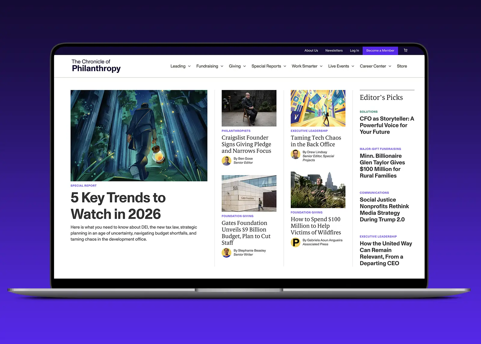
The Chronicle of Philanthropy is an iconic publication with 30+ years of rigorous journalistic coverage for the social sector. Faced with the changing landscape of publishing, The Chronicle wanted to establish a new design system that would reinvigorate its online brand presence and amplify its new professional development service offering.
As Lead UI Designer, I owned the creation of their new design system from the ground up and partnered with product engineers to deliver consistent and intuitive experiences across every surface.
The Challenge
There were a few real constraints that I had to navigate to deliver high-quality results on time:
A four-month timeline. With a firm project timeline of 4 months from kickoff to launch, time was the largest constraint. I worked closely with the project team to map out 5 two-week iterative UX/UI sprints that account for over 40+ design components and ensure proper client feedback cycles.
Creating Trust Between Disciplines. Aside from the time constraint, the harder problem was how to create a single source of truth between the Chronicle's design team and their external engineering team. The challenge was not designing a fixed library of components. It was building a system that could support consistent decision-making that could scale across distributed teams.
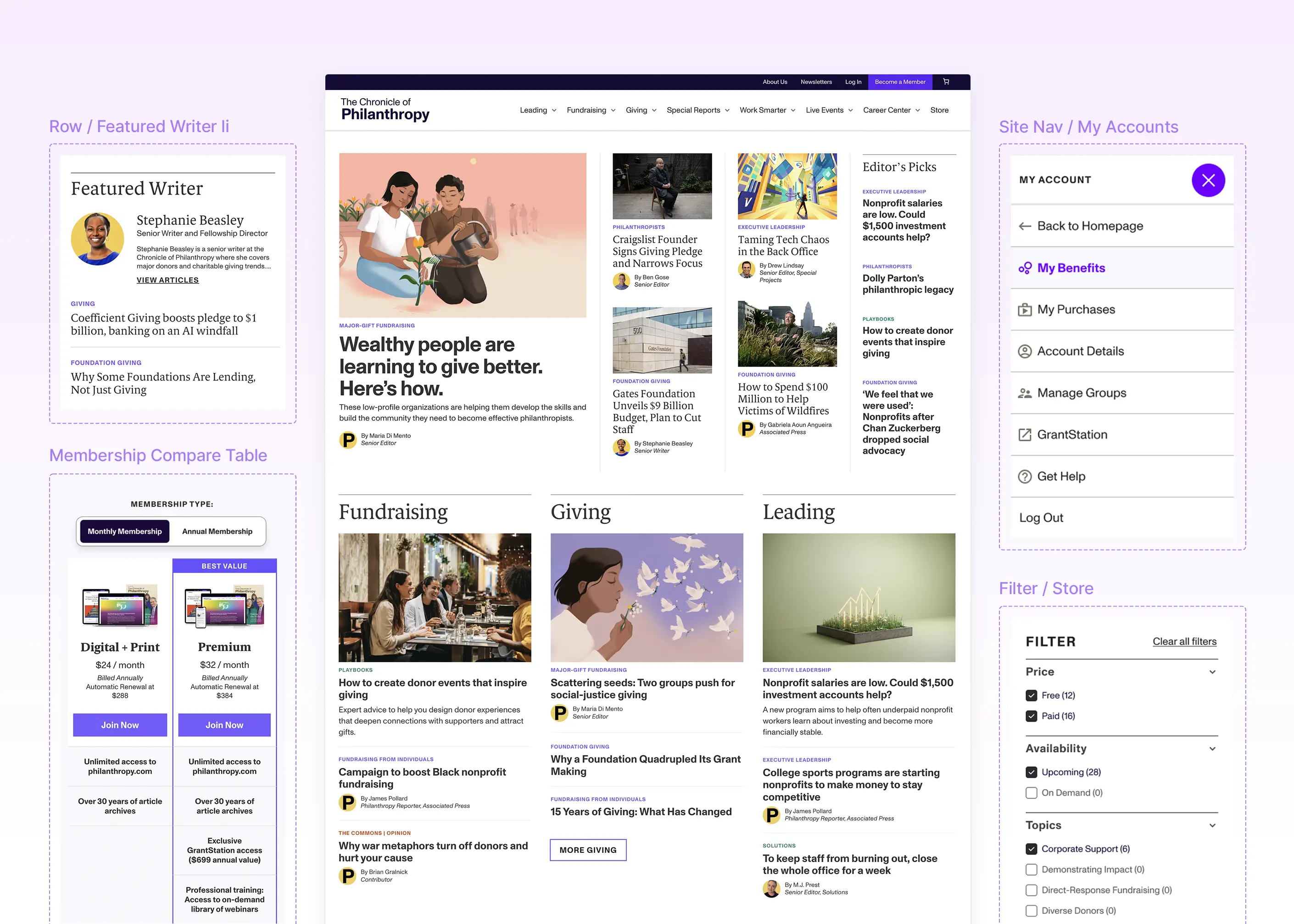
Components from the Editorial Homepage
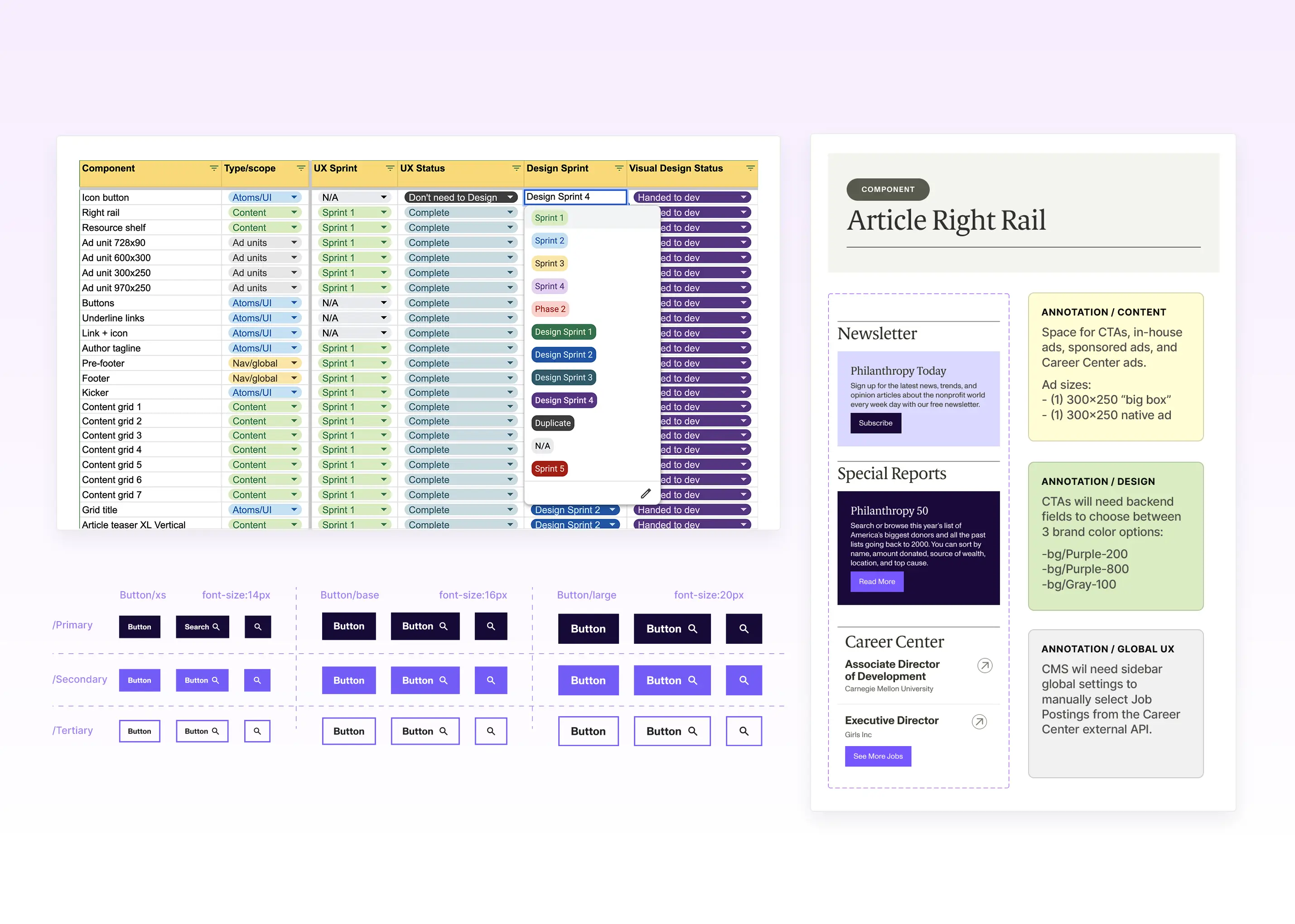
The Sprint Timeline was organized to prioritize creating the foundation of design tokens early on, to then scale production to over 40+ reusable components
The Process
I approached the design system as an organizational opportunity, focusing on creating a structure that future teams would actually use while giving it a solid foundation for scalability.
Design Tokens first, Components second. Before designing a single component, I established the design token foundation of color, type presets, and spacing. Once the client and I aligned on their editorial typeface choice and their vibrant gem-tone color palette, I documented the design tokens to be reusable throughout the library. That groundwork made the process of designing over 40+ reusable components to be rapid because the key design decisions were already approved and documented.
One Figma workspace as the shared source of truth. After a few rounds of client feedback, it became apparent that we needed a single source of truth outside the working files and presentations. The solution was to create a shared figma workspace between all the teams that would include all approved design artifacts. Since this design library would only include finalized files, it made the handoff to engineering more transparent and reliable.
Early QA made System Building More Streamlined.
I took ownership in performing Quality Assurance on the engineers’ initial Pull Request (PR) for the design tokens before component design work ramped up. By aligning early on in the process, we were able to accelerate trust between teams and establish a solid foundation before the component library iterated incrementally with each new sprint.
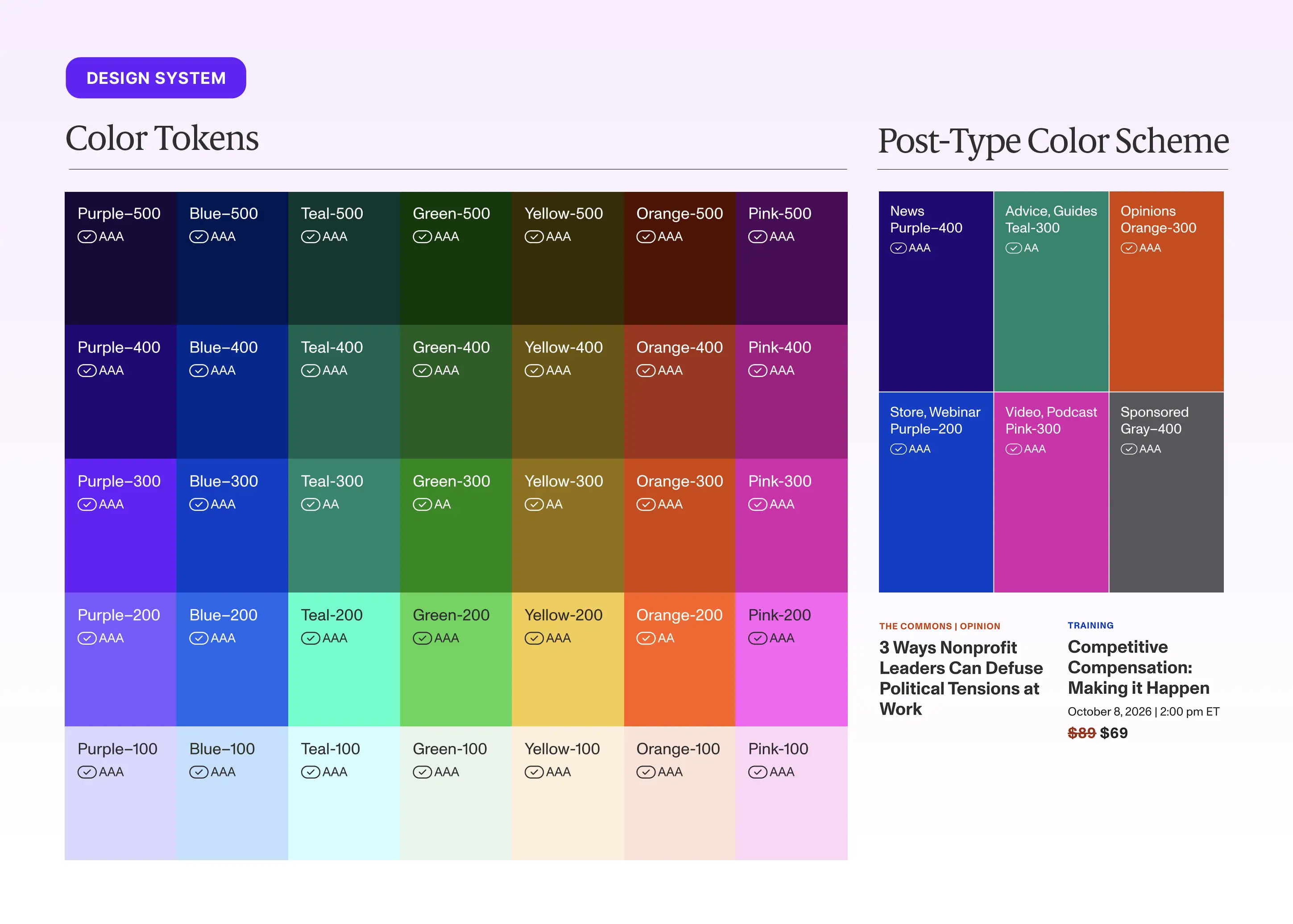
The vibrant gem-tone color palette was applied to content eyebrows to differentiate post types throughout the site. Having an extensive brand palette empowered the Chronicle's Social team to experiment with creating bold content while staying on-brand.
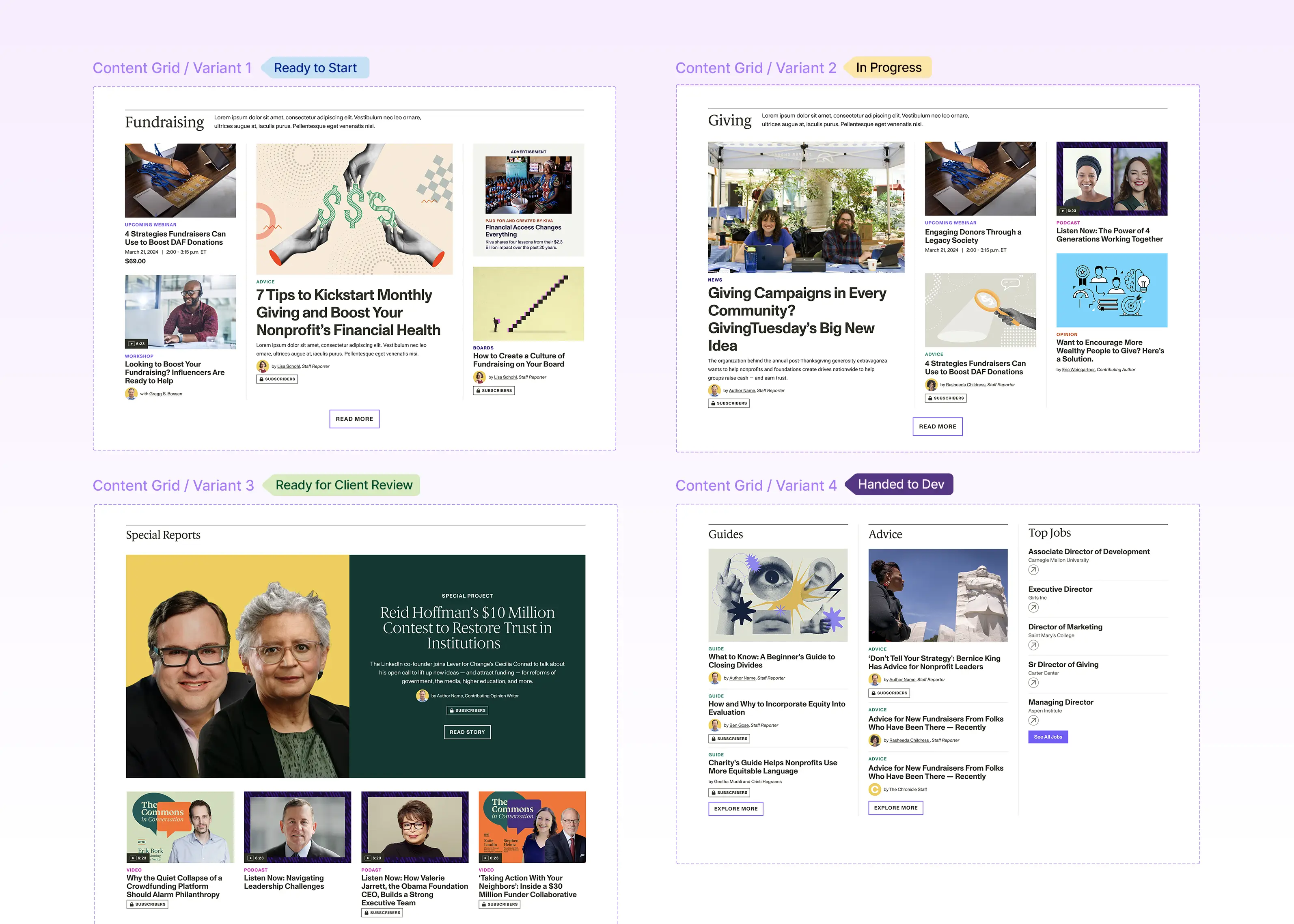
Adding ‘In-Progress’ labels to the components throughout the sprints made cross-discipline communication more transparent.
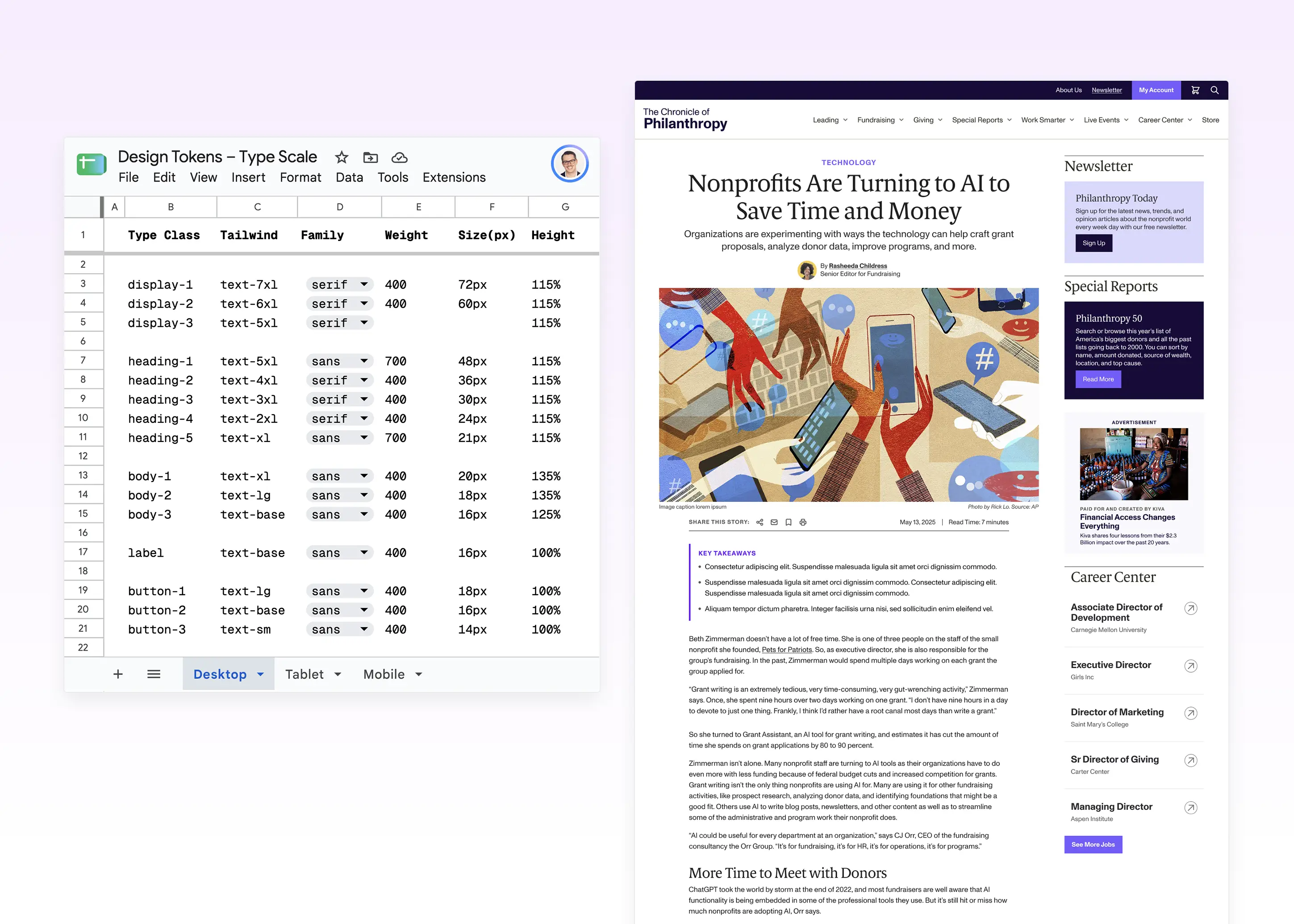
Documenting the responsive Type Scale as a design token gave the whole system a consistent foundation for editorial hierarchy.
Outcomes
Cleaner Aesthetic for both Magazine Redesign and Design System: My work on the design system not only affected the website design, but also guided the redesign of The Chronicle of Philanthropy's Magazine. I worked directly with the Chronicle’s Art Director to optimize the colors for printing and ensure the type hierarchy was consistent with how it appears on the web components. The overall reception of the redesign was extremely positive.
Revamped UX that streamlines learning verticals and new practical tools: The new website reorganizes content into new verticals (Leading, Fundraising, Giving) to better align with how their different audience types engage with their content. The website also houses new resources and toolkits that expand the Chronicle beyond news and into professional development offerings.
Deep Dive: Accounts Benefit Redesign
I ran a separate design sprint and stakeholder workshop specifically to address recurring pain points in the Account Benefits section. Here are some results:
Reduce Cognitive Load. My main recommendation was to consolidate related navigation actions like ‘Profile & Settings’ and ‘Privacy Settings’ into single pages like ‘Account Details’ to reduce the amount of navigation options. I also designed nav icons to give instant context which led to quicker decision making.
Benefits front and center. By making the ‘My Benefits’ page the ‘homepage’ within the Account section, the page gave users a more clear view of what was included in their membership.
Clearer Visual Hierarchy. I implemented Grouped related items to make the dashboard easier to scan for new and returning users.
Membership value made explicit. I designed a prominent Call-to-Action at the top to highlight member’s largest benefit of accessing the Chronicle's library behind the paywall. I also created a secondary upgrade membership CTA so users better understand the benefits of updating to a higher membership tier.
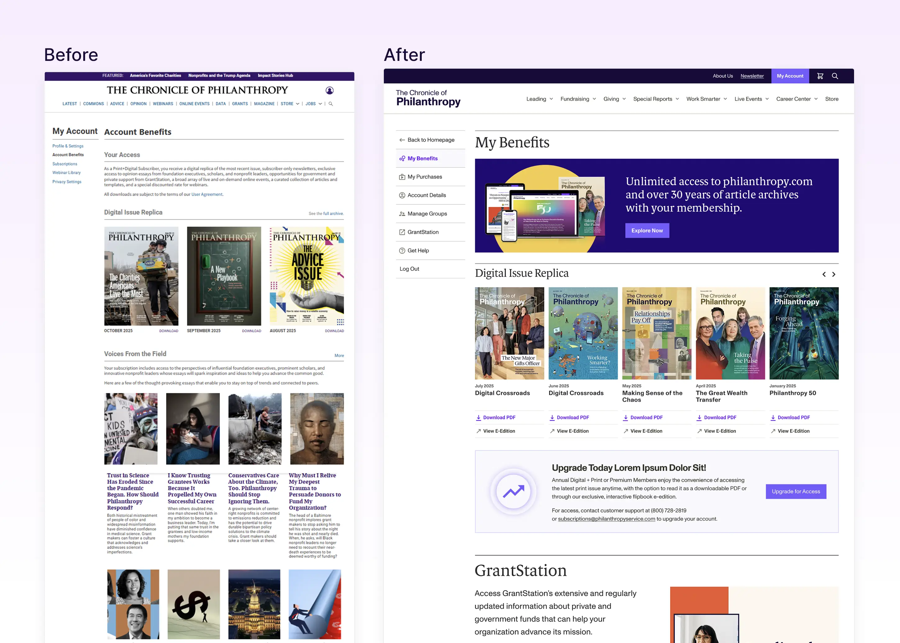
The Account Benefit section redesign was a good test of whether the new system could hold up under the Chronicle's Customer Relationship Management.
Reflections
QA needs proper time. It’s one thing to deliver an exceptional well-documented design system within figma, but the implementation process is completely different. It was challenging within the condensed timeline to perform appropriate quality assurance because everyone was sprinting to finish the work before launch. In retrospect, I wish we were a bit more aligned with the external development team during the QA phase so we were able to polish the experience a bit more. I believe excellence comes from the small details and interactions, so it’s always important to carve out enough time to collaborate with engineers to make the product shine.
Labeling progress is crucial to cross-team communication. One obstacle I ran into early in the process was how to successfully communicate with multiple people about the progress of certain components. I collaborated with the project team on a color label system across figma and asana that notates where each component is, spanning from “in-progress”,”internal review”, “ready for client feedback”, and finally “Handed to the Developer”. This simple yet effective flag was able to signal across all teams the overall project progress.
Next Case Study

A Design System Sprint that Unified Web, Magazine, and Account Experiences
Role
Senior Designer
Agency
Constructive
My Contribution
Design System
Component Library
UI Design
Brand Refresh
Context
The Chronicle of Philanthropy is an iconic publication with 30+ years of rigorous journalistic coverage for the social sector. Faced with the changing landscape of publishing, The Chronicle wanted to establish a new design system that would reinvigorate its online brand presence and amplify its new professional development service offering.
As Lead UI Designer, I owned the creation of their new design system from the ground up and partnered with product engineers to deliver consistent and intuitive experiences across every surface.
The Challenge
There were a few real constraints that I had to navigate to deliver high-quality results on time:
A four-month timeline. With a firm project timeline of 4 months from kickoff to launch, time was the largest constraint. I worked closely with the project team to map out 5 two-week iterative UX/UI sprints that account for over 40+ design components and ensure proper client feedback cycles.
Creating Trust Between Disciplines. Aside from the time constraint, the harder problem was how to create a single source of truth between the Chronicle's design team and their external engineering team. The challenge was not designing a fixed library of components. It was building a system that could support consistent decision-making that could scale across distributed teams.
Components from the Editorial Homepage
The Sprint Timeline was organized to prioritize creating the foundation of design tokens early on, to then scale production to over 40+ reusable components
The Process
I approached the design system as an organizational opportunity, focusing on creating a structure that future teams would actually use while giving it a solid foundation for scalability.
Design Tokens first, Components second. Before designing a single component, I established the design token foundation of color, type presets, and spacing. Once the client and I aligned on their editorial typeface choice and their vibrant gem-tone color palette, I documented the design tokens to be reusable throughout the library. That groundwork made the process of designing over 40+ reusable components to be rapid because the key design decisions were already approved and documented.
One Figma workspace as the shared source of truth. After a few rounds of client feedback, it became apparent that we needed a single source of truth outside the working files and presentations. The solution was to create a shared figma workspace between all the teams that would include all approved design artifacts. Since this design library would only include finalized files, it made the handoff to engineering more transparent and reliable.
Early QA made System Building More Streamlined.
I took ownership in performing Quality Assurance on the engineers’ initial Pull Request (PR) for the design tokens before component design work ramped up. By aligning early on in the process, we were able to accelerate trust between teams and establish a solid foundation before the component library iterated incrementally with each new sprint.
The vibrant gem-tone color palette was applied to content eyebrows to differentiate post types throughout the site. Having an extensive brand palette empowered the Chronicle's Social team to experiment with creating bold content while staying on-brand.
Adding ‘In-Progress’ labels to the components throughout the sprints made cross-discipline communication more transparent.
Documenting the responsive Type Scale as a design token gave the whole system a consistent foundation for editorial hierarchy.
Outcomes
Cleaner Aesthetic for both Magazine Redesign and Design System: My work on the design system not only affected the website design, but also guided the redesign of The Chronicle of Philanthropy's Magazine. I worked directly with the Chronicle’s Art Director to optimize the colors for printing and ensure the type hierarchy was consistent with how it appears on the web components. The overall reception of the redesign was extremely positive.
Revamped UX that streamlines learning verticals and new practical tools: The new website reorganizes content into new verticals (Leading, Fundraising, Giving) to better align with how their different audience types engage with their content. The website also houses new resources and toolkits that expand the Chronicle beyond news and into professional development offerings.
Deep Dive: Accounts Benefit Redesign
I ran a separate design sprint and stakeholder workshop specifically to address recurring pain points in the Account Benefits section. Here are some results:
Reduce Cognitive Load. My main recommendation was to consolidate related navigation actions like ‘Profile & Settings’ and ‘Privacy Settings’ into single pages like ‘Account Details’ to reduce the amount of navigation options. I also designed nav icons to give instant context which led to quicker decision making.
Benefits front and center. By making the ‘My Benefits’ page the ‘homepage’ within the Account section, the page gave users a more clear view of what was included in their membership.
Clearer Visual Hierarchy. I implemented Grouped related items to make the dashboard easier to scan for new and returning users.
Membership value made explicit. I designed a prominent Call-to-Action at the top to highlight member’s largest benefit of accessing the Chronicle's library behind the paywall. I also created a secondary upgrade membership CTA so users better understand the benefits of updating to a higher membership tier.
The Account Benefit section redesign was a good test of whether the new system could hold up under the Chronicle's Customer Relationship Management.
Reflections
QA needs proper time. It’s one thing to deliver an exceptional well-documented design system within figma, but the implementation process is completely different. It was challenging within the condensed timeline to perform appropriate quality assurance because everyone was sprinting to finish the work before launch. In retrospect, I wish we were a bit more aligned with the external development team during the QA phase so we were able to polish the experience a bit more. I believe excellence comes from the small details and interactions, so it’s always important to carve out enough time to collaborate with engineers to make the product shine.
Labeling progress is crucial to cross-team communication. One obstacle I ran into early in the process was how to successfully communicate with multiple people about the progress of certain components. I collaborated with the project team on a color label system across figma and asana that notates where each component is, spanning from “in-progress”,”internal review”, “ready for client feedback”, and finally “Handed to the Developer”. This simple yet effective flag was able to signal across all teams the overall project progress.