
Rebranded a Landowner-First Carbon Nonprofit for Better Land Stewardship.
Role
Senior Designer
My Contribution
Logo Design
Brand Identity
Print Design
Website Design
Agency
Constructive
Context
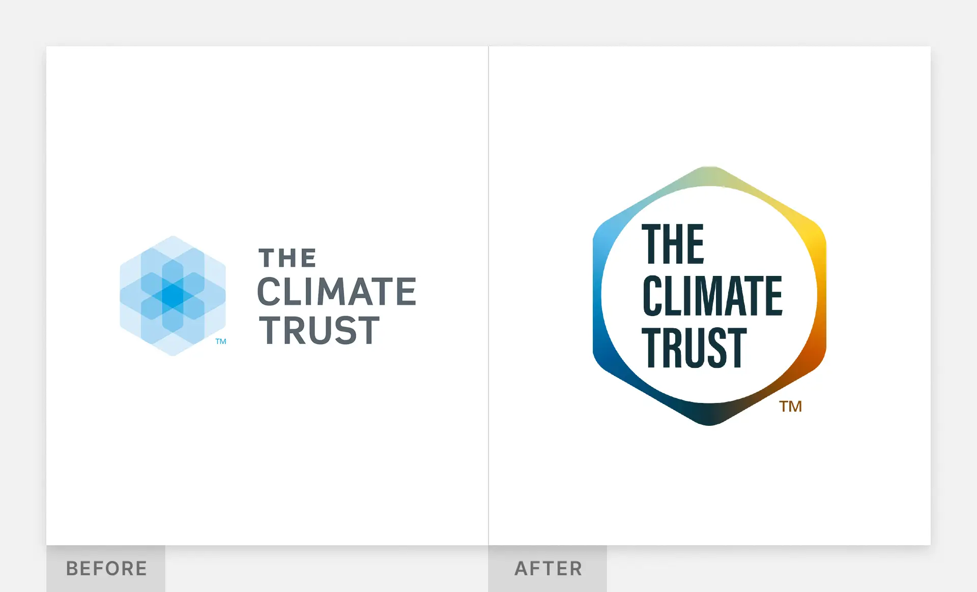
The Climate Trust needed a new brand and website that positioned the organization as an established landowner-first nonprofit in the crowded carbon-market field of tech startups.
The main challenge was how to serve two very different audiences of landowners/rural communities and investors without diluting either message. There is a perception among landowners who are wary of Silicon Valley climate tech, so the new brand messaging needed to be trustworthy and boots-on-the-ground.
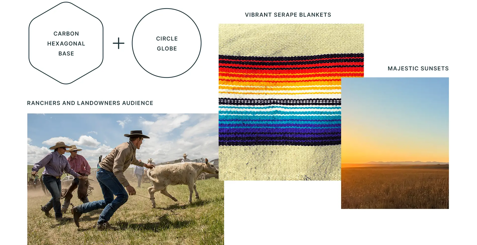
Moodboard and Logo Inspiration. Since the new brand had to feel warm and grounded, I took inspiration directly from nature.

A Timeless Logo Design that Demands Attention. I created the structure of the logo by interlocking the hexagonal structure of carbon with a circle that represents the globe. The logo is a reminder of how carbon markets are an interconnected nature-based solution for tackling climate change. Its simplicity and geometry feels both timeless and elegant.
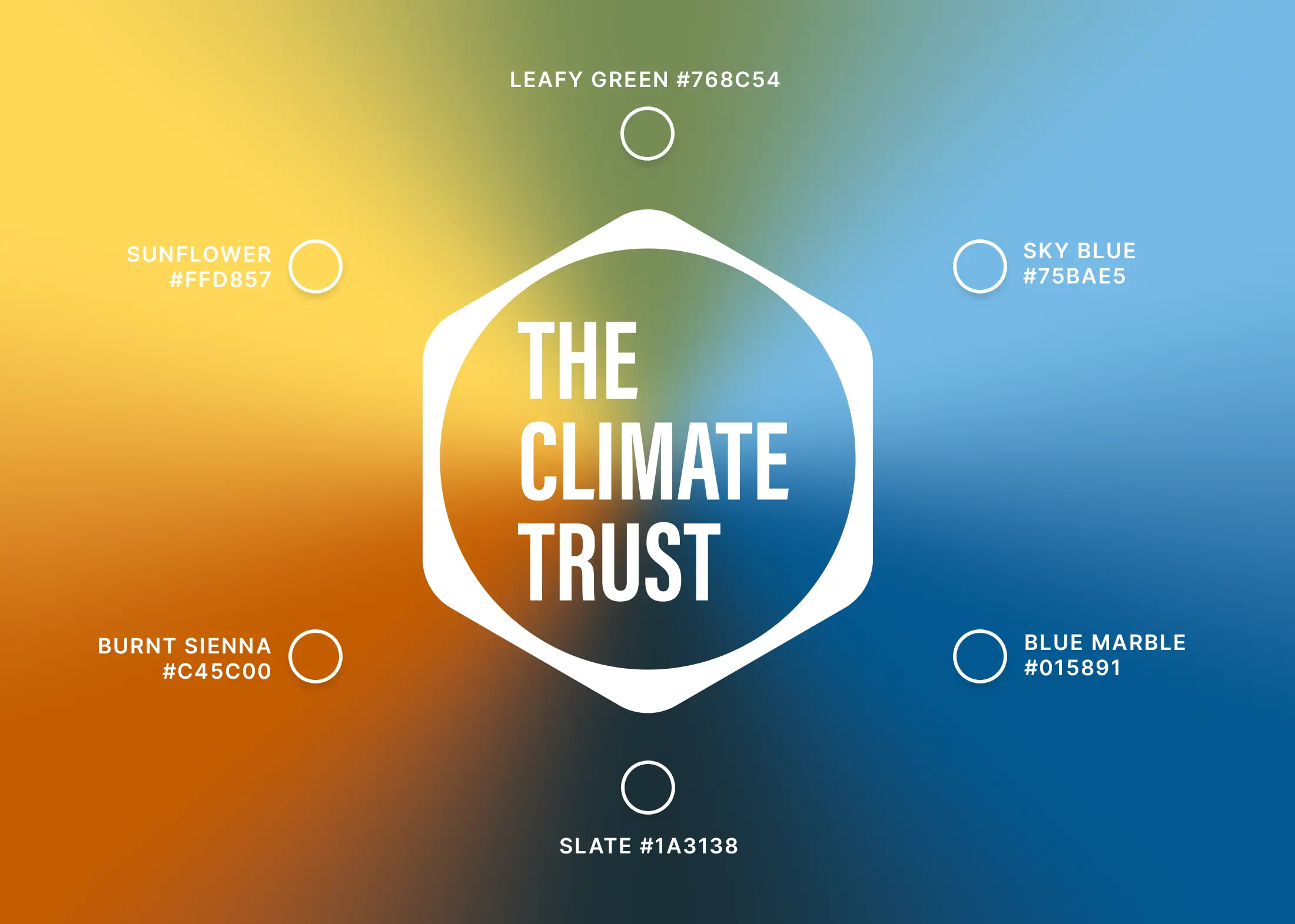
Nature Inspired Color Palette. The color palette is anchored in earth tones with the logo’s gradient inspired by the majesty of a sunset sky over a vast landscape. The brand identity celebrates nature’s inherent transcendentalism rather than appealing to any trends.
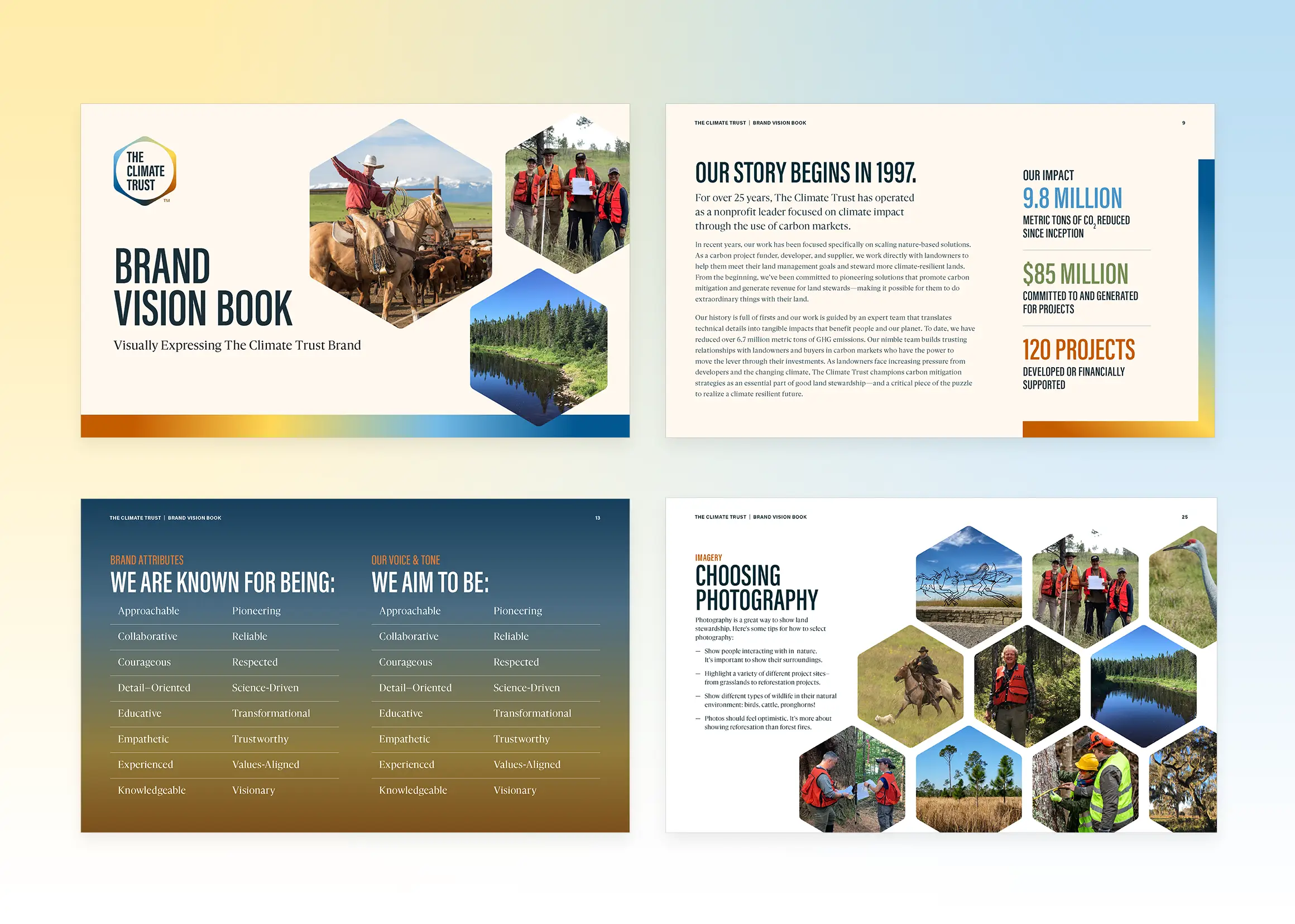
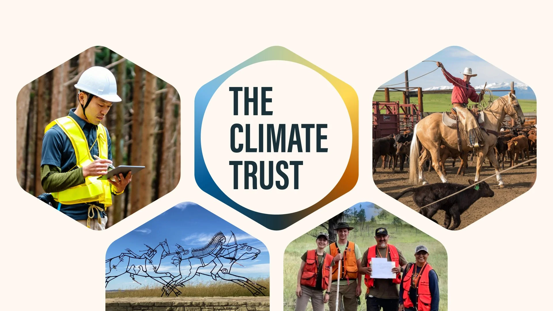
Real Project Photography Depicts Real Solutions. I also directed a photography strategy for capturing real photos of landowners to visually demonstrate what good land stewardship can be for a better climate. Each photo is a chance to show how nature-based projects can benefit both people and the climate.
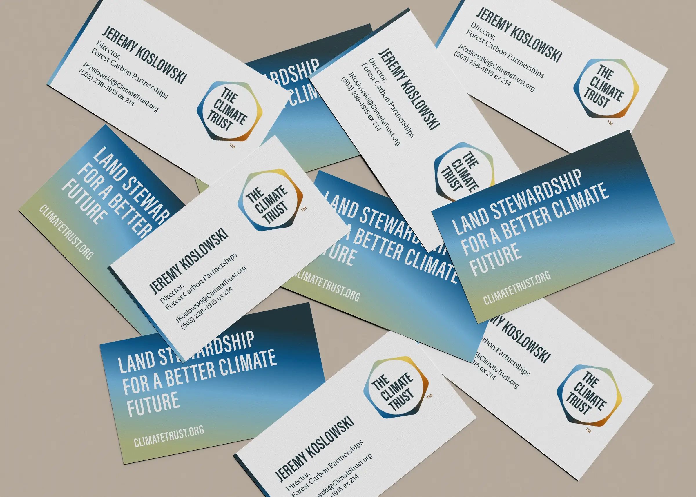
Bold Typography Grounded the Experience. I selected typefaces that feel accessible and warm to support the brand’s “approachable expert” attribute. I also introduced a bolder condensed san-serif that allows for more urgent climate messaging.

Visualizations Helped Clarify Carbon Complexity. I developed a series of illustrated infographics and stepped process visualizations to act as core storytelling devices that simplified Climate Trust’s technically complex offerings.

Website Strategy needed to be Audience-centered. I structured the website navigation and content strategy around their different audiences to ensure each audience reached relevant information with minimal clicks.

Outcomes
The new brand has been warmly embraced by both the staff and their partners. The new design system has amplified the team’s voice, influence, and thought leadership online and at live events.
The Climate Trust’s website won a W3 Award in 2024 for the Environmental & Sustainability category.
Next Case Study

Rebranded a Landowner-First Carbon Nonprofit for Better Land Stewardship.
Role
Senior Designer
Agency
Constructive
My Contribution
Logo Design
Brand Identity
Print Design
Website Design
Context
The Climate Trust needed a new brand and website that positioned the organization as an established landowner-first nonprofit in the crowded carbon-market field of tech startups.
The main challenge was how to serve two very different audiences of landowners/rural communities and investors without diluting either message. There is a perception among landowners who are wary of Silicon Valley climate tech, so the new brand messaging needed to be trustworthy and boots-on-the-ground.
Moodboard and Logo Inspiration. Since the new brand had to feel warm and grounded, I took inspiration directly from nature.
A Timeless Logo Design that Demands Attention. I created the structure of the logo by interlocking the hexagonal structure of carbon with a circle that represents the globe. The logo is a reminder of how carbon markets are an interconnected nature-based solution for tackling climate change. Its simplicity and geometry feels both timeless and elegant.
Nature Inspired Color Palette. The color palette is anchored in earth tones with the logo’s gradient inspired by the majesty of a sunset sky over a vast landscape. The brand identity celebrates nature’s inherent transcendentalism rather than appealing to any trends.
Real Project Photography Depicts Real Solutions. I also directed a photography strategy for capturing real photos of landowners to visually demonstrate what good land stewardship can be for a better climate. Each photo is a chance to show how nature-based projects can benefit both people and the climate.
Bold Typography Grounded the Experience. I selected typefaces that feel accessible and warm to support the brand’s “approachable expert” attribute. I also introduced a bolder condensed san-serif that allows for more urgent climate messaging.
Visualizations Helped Clarify Carbon Complexity. I developed a series of illustrated infographics and stepped process visualizations to act as core storytelling devices that simplified Climate Trust’s technically complex offerings.
Website Strategy needed to be Audience-centered. I structured the website navigation and content strategy around their different audiences to ensure each audience reached relevant information with minimal clicks.
Outcomes
The new brand has been warmly embraced by both the staff and their partners. The new design system has amplified the team’s voice, influence, and thought leadership online and at live events.
The Climate Trust’s website won a W3 Award in 2024 for the Environmental & Sustainability category.